
01
Context
Namada is the next generation in blockchain technology, the first chain in the Anoma ecosystem, providing multi-asset privacy for end users. This allows Namada to be one of the most secure ways to send tokens.
This ecosystem is composed of a wide range of research, protocols, tooling, and applications.
This ecosystem is composed of a wide range of research, protocols, tooling, and applications.
The team building @anomanetwork
Role: UI/UX Design / Branding / Website Design
Date: June 2021 - August 2022
Date: June 2021 - August 2022
Website: www.namada.net
Goals:
> Create a completely new brand identity and website but aligned with the vision of Anoma ecosystem.
> Be authentic and innovative in the blockchain industry by rethinking common visual aesthetics in the field.
> Create a strong, bold and radical tone of voice.
> Be authentic and innovative in the blockchain industry by rethinking common visual aesthetics in the field.
> Create a strong, bold and radical tone of voice.
02
DESIGN PROCESS
This project included:
> New brand identity
> Namada website and UI & UX developed
> Namada cryptowallet app (in development process </>)
> Namada website and UI & UX developed
> Namada cryptowallet app (in development process </>)
02.1 BRAND IDENTITY
> Create brand’s unique visual identity.
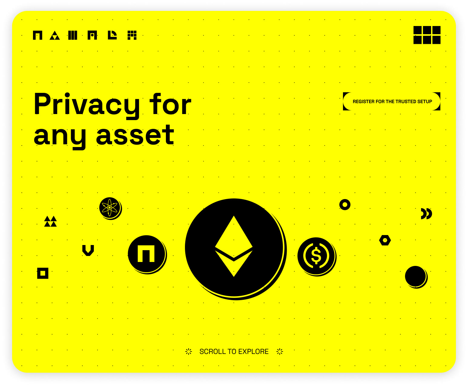
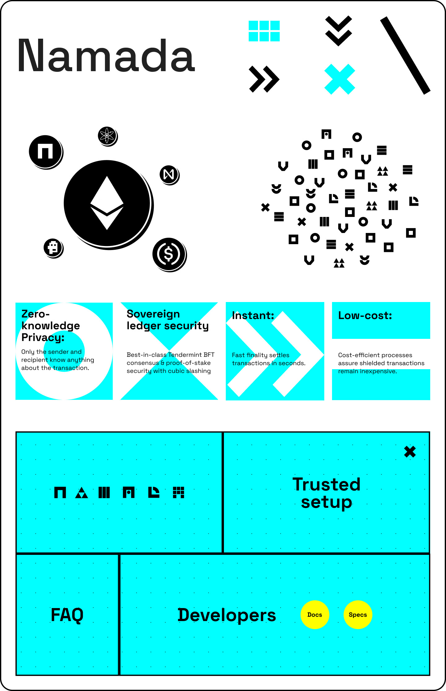
We created Namada logo, typography, identics, user-friendly and engaging web design.
The identity consists of a number of coded symbols that represent the private 'NAM' tokens. These are used as graphic assets along with a vibrant color palette to create a brand that stands out among the common aesthetic in the blockchain space.
We aimed to create visual positioning that reflects & matches product's values, goals and generates desired emotional response.
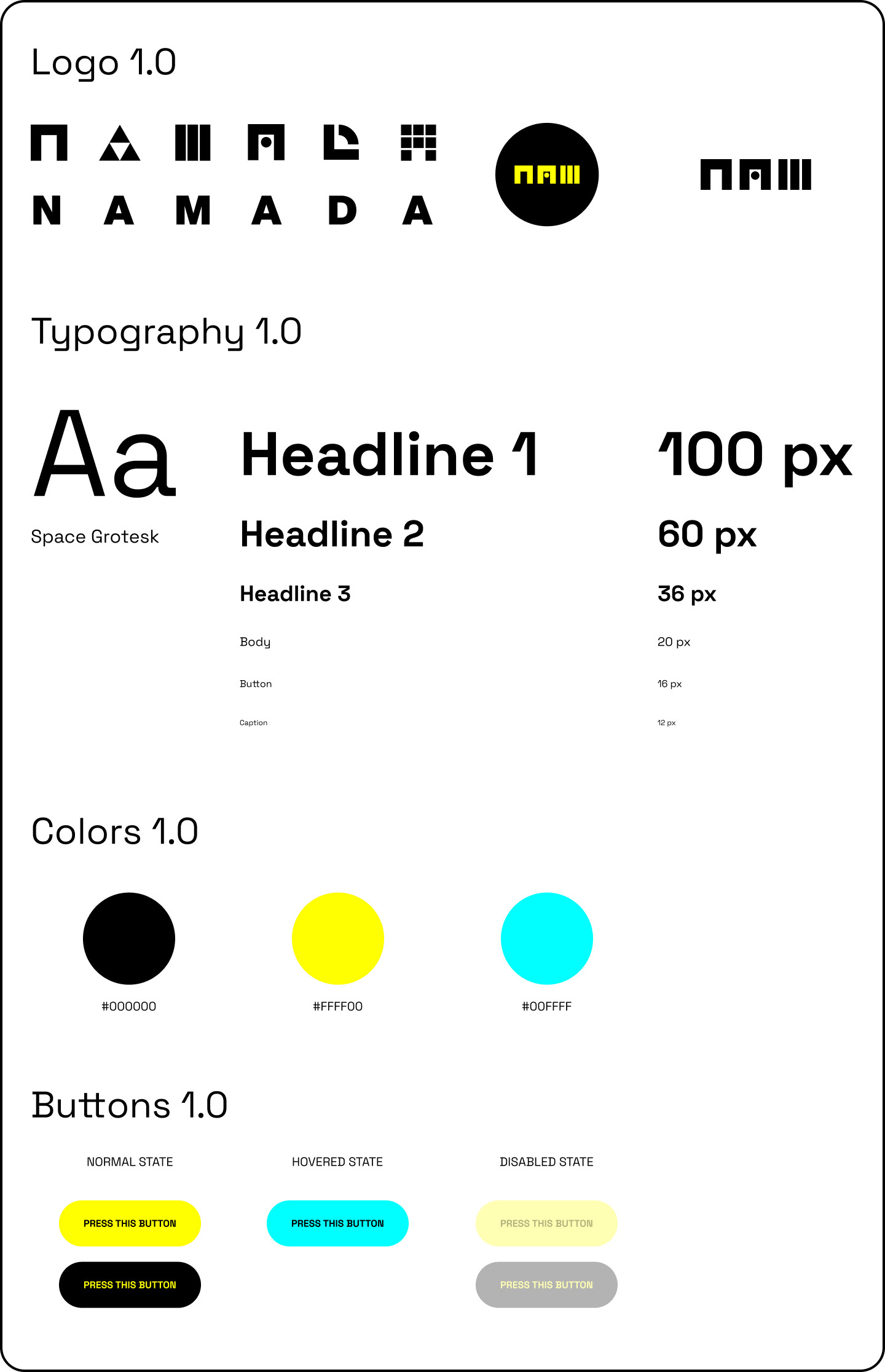
Namada Style Guide
Namada Style Guide
02.2 UI/UX DESIGN: RESEARCH
Why Research Matters
Whether you work at a large company or a startup, one huge key to success is that you must talk to your customers.
Without talking to users you risk the expensive mistake of creating something they don't want.
Data and analytics can only tell you the "what".
But research and talking to people allows you to dig deep and understand the "why" behind their behavior.
For our V.1.0 of Namada Wallet:
> Firstly, we created a Lean UX canvas survey to understand our user needs and fears. And placed all the information as well in Asana to follow tasks and competences.
> Secondly, we sent a survey through Google Docs to our users and stakeholders, which included some questions to get a better understanding of our target, a link to our Figma wallet prototype and a list of tasks to be accomplished.
> Together with the Product Team, we organized all the information gathered and created an Affinity Map in Figma to help us create personas and improve our product.
> Finally, we summarize all the data gathered in a shareable Research Poster with our stakeholders, transforming our insight into real finding. Included Problems Founded, Suggested Features, Visual Recommendations, Specific Content Recommendations and What Users Think.
> I participated actively in this scope together with Researchers.
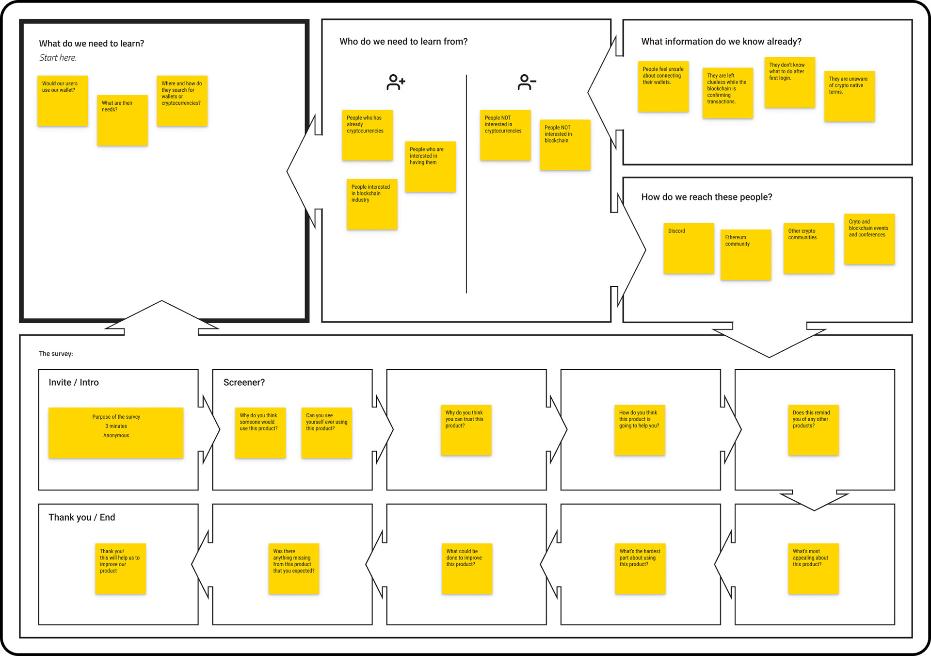
Lean UX Survey Canvas
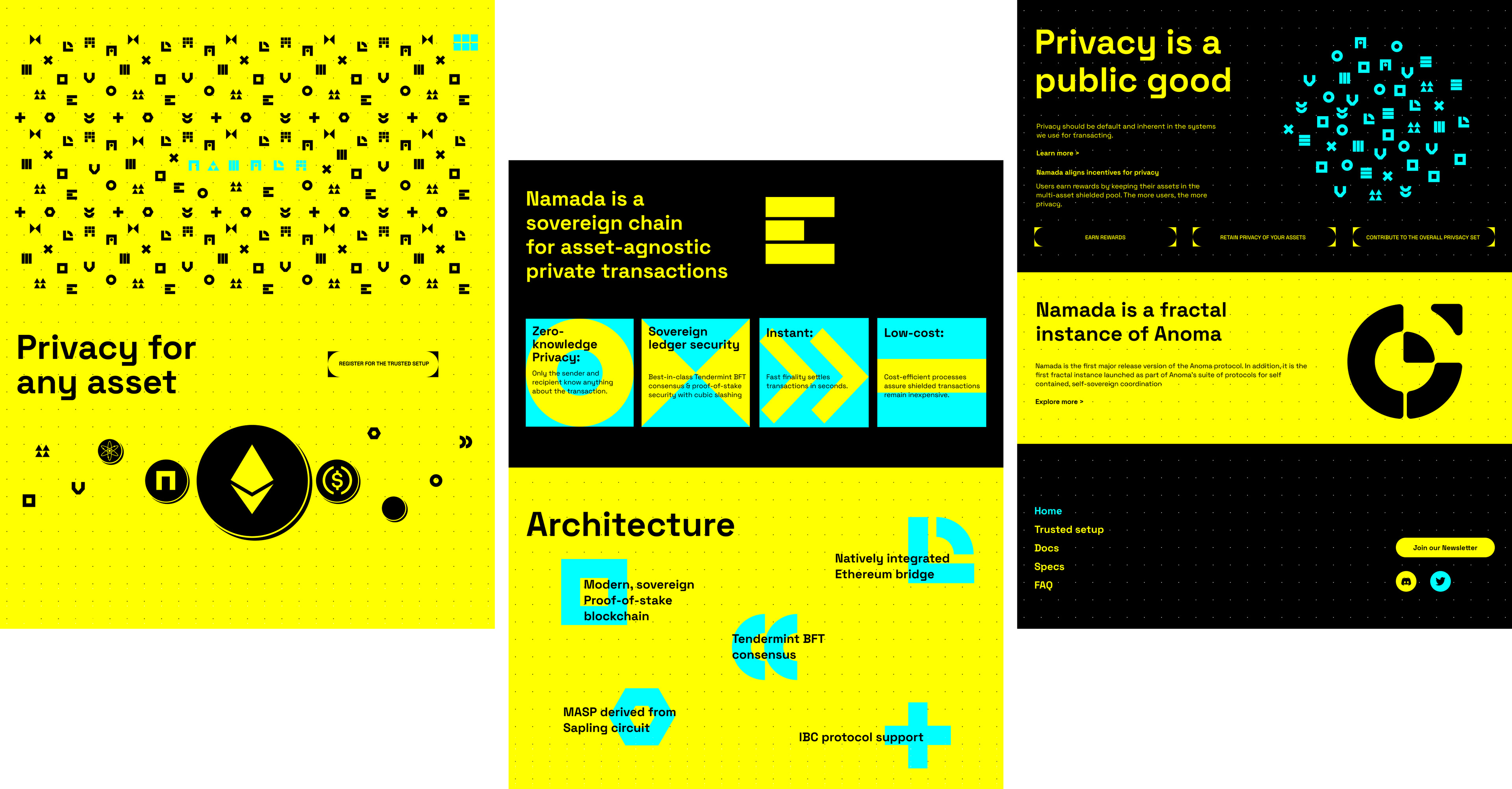
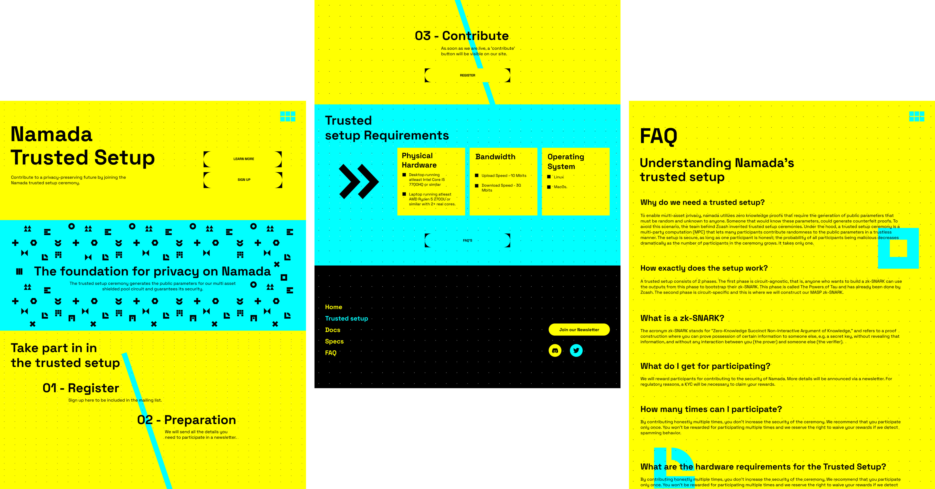
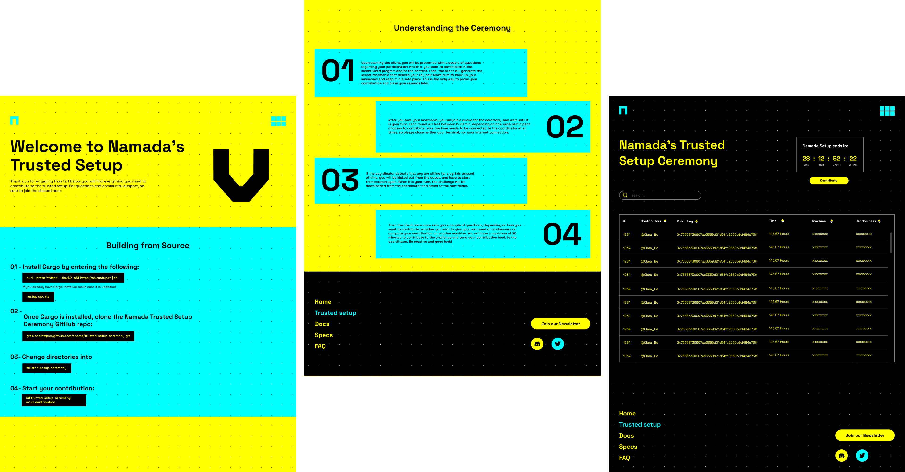
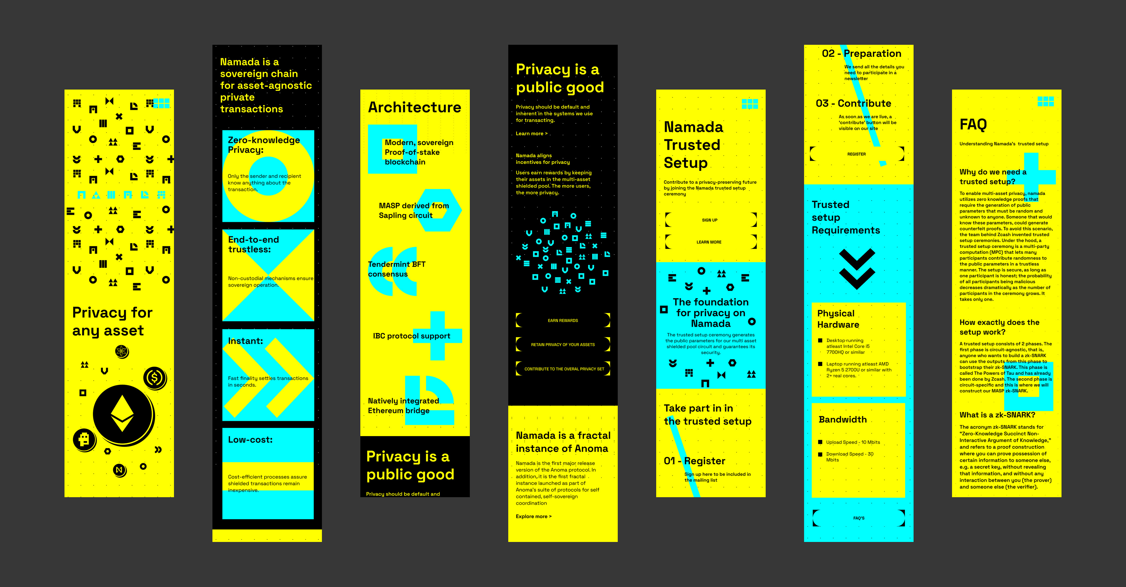
02.3 WEBSITE AND UI/UX DEVELOPED
> Deliver user-friendly & responsive web design.
Our goal was to create a functional design & responsive for all devices.
Our goal was to create a functional design & responsive for all devices.
> Engage users.
We added numerous micro-interactions to motivate and engage users to interact within the website.
We added numerous micro-interactions to motivate and engage users to interact within the website.
After we outlined approximate functionality and flows, we started to work on prototyping and design the website.
We designed web’s wireframes and clickable prototypes based on written specifications and mock-ups.
WIREFRAMES V1.0
Starting with the skeleton of the website: the wireframes.
This skeleton was a two-dimensional depiction that showed the spacing of elements, how content is prioritized, what functionalities are available, and how users will interact with the site. They also played a vital role in connecting information architecture to the visual aspects of the design by showing pathways between the various pages.
Wireframes allowed us to focus on more fundamental questions about the layout of the pages,without getting caught up in a lot of details before we sent them to the developing team.
I crafted 3 different design routes:
1. The Grid: Created and layout the content based on a square grid. Using geometric assets for articulating the content and as visual elements.
2. The Techie: Used a tech aesthetic to engage with our users.
3. The Private: Designed a hand-craft visual aesthetic with included strikethrough, hidden words which play an important role in Namada’s primary goal: Privacy.
2. The Techie: Used a tech aesthetic to engage with our users.
3. The Private: Designed a hand-craft visual aesthetic with included strikethrough, hidden words which play an important role in Namada’s primary goal: Privacy.
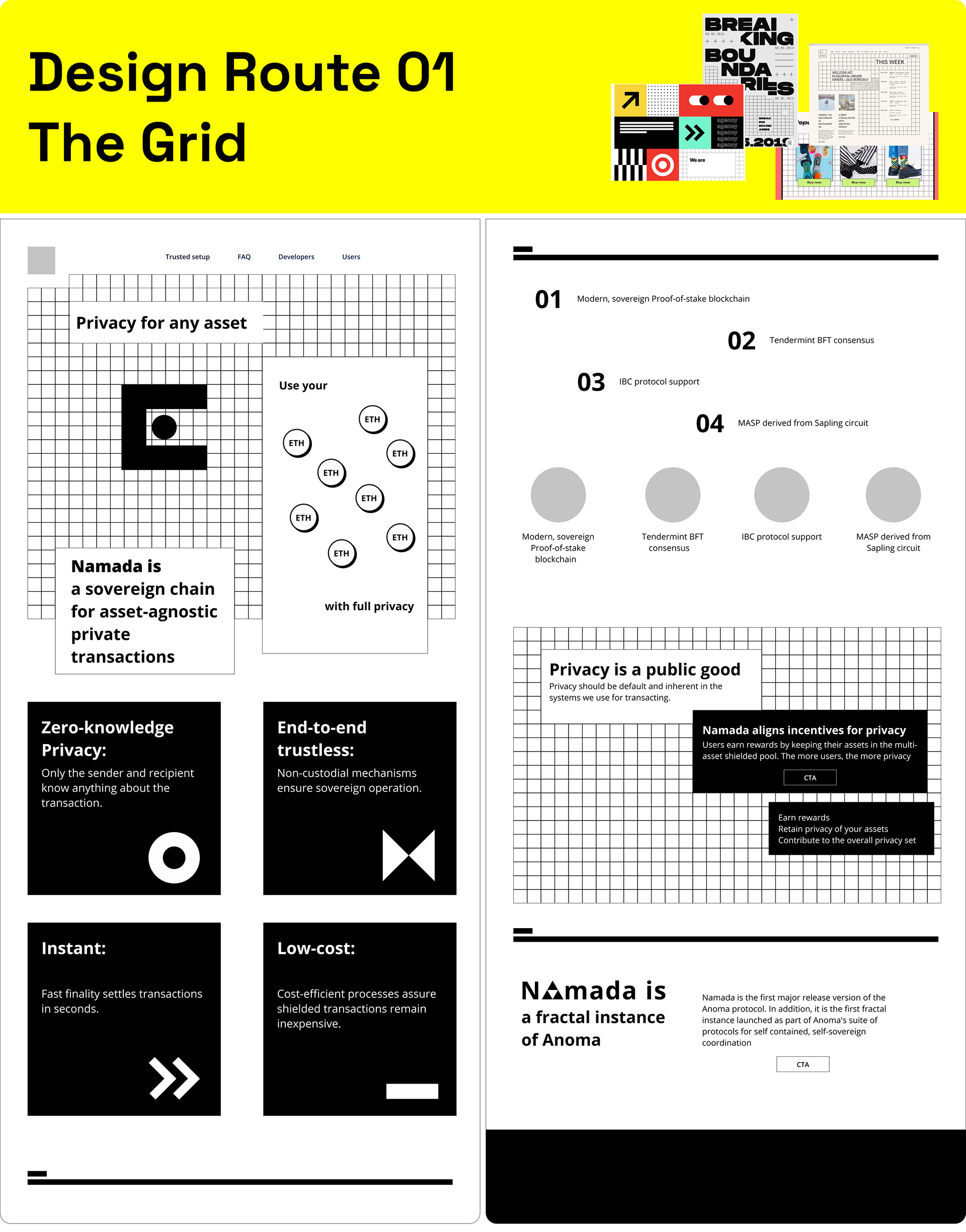
Design Route 01
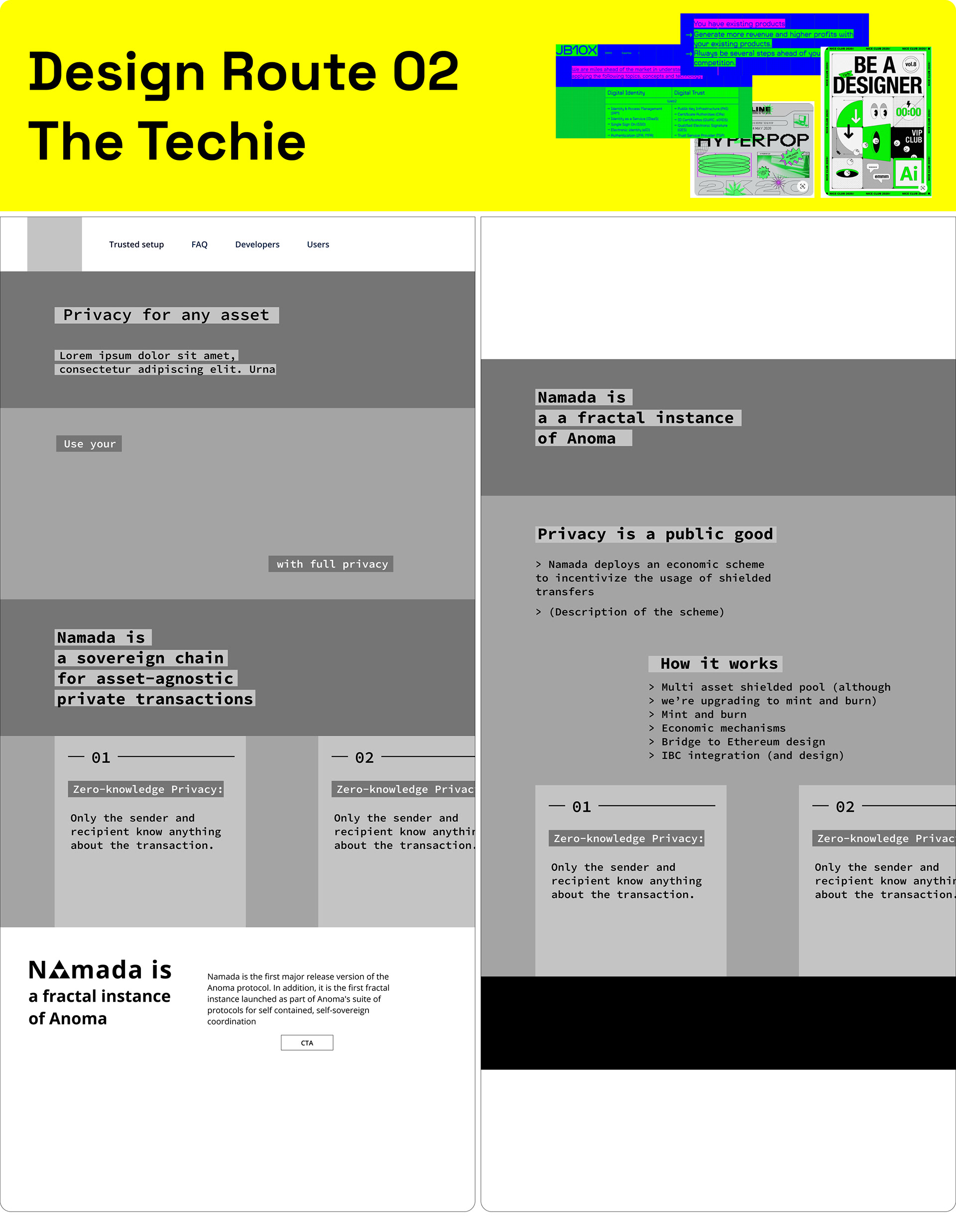
Design Route 02
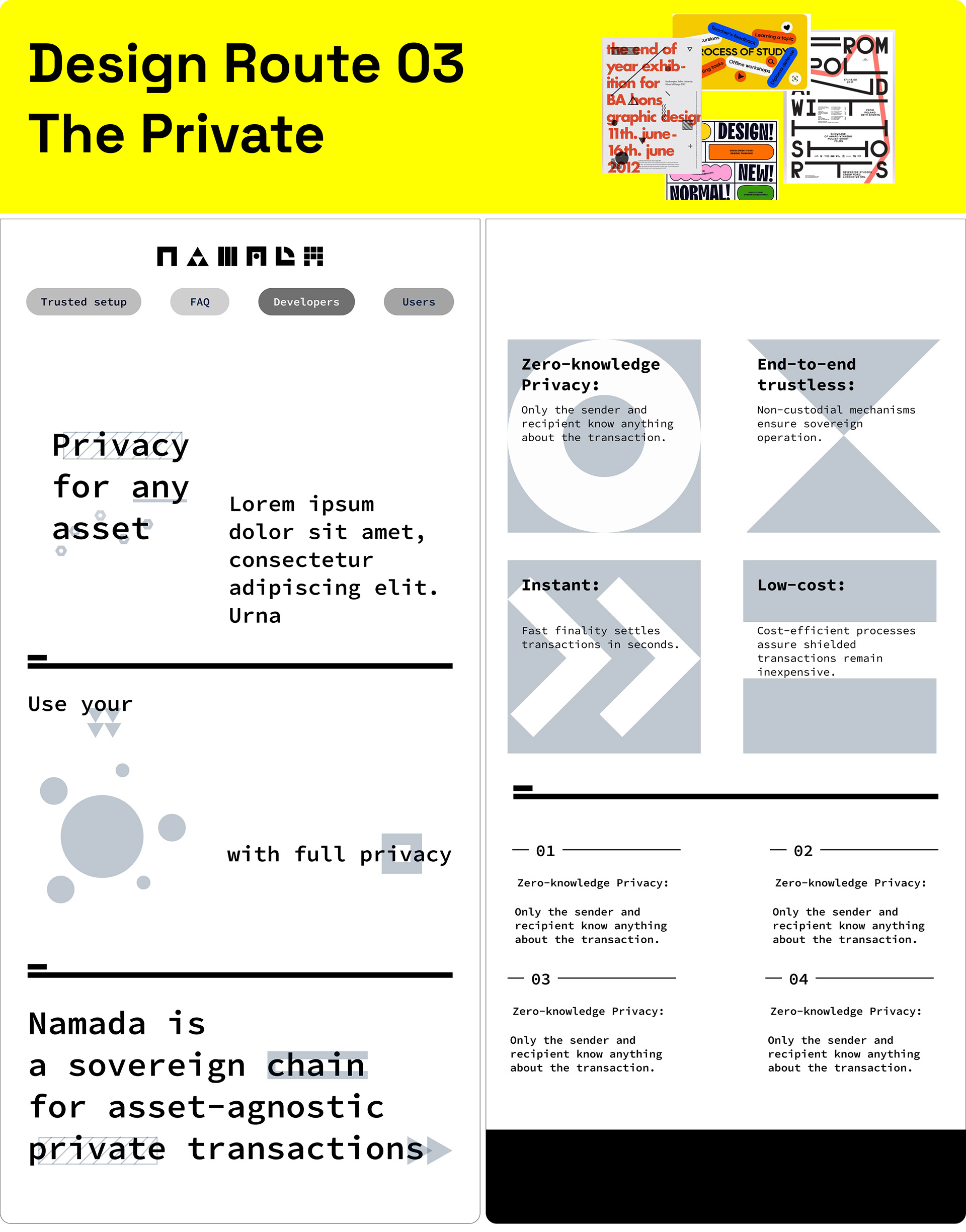
Design Route 03
PROTOYPES V1.0
We used an Agile development process to build Namada website. Agile development is an iterative software-development methodology with self-organized and cross-functional teams.
The product team, together with the development team, decided to use Design route 01 (The Grid) and combine some design elements (as the privacy concept) used in Design route 03.
Goals:
> Designing for understanding:
The user interface has to be very easy and accessible for users with different levels of tech-literacy. By simplifying the message for the more casual users and understanding their behaviors, we ensured that all the information presented on the website was valuable and clear.
> Designing for trust:
When dealing with highly sensitive data, maintaining the user’s trust is critical. Users must perceive the applications to be reliable, trustworthy, and stable. This is accomplished through data exposure, consistency, feedback, and active guidance. Designing this into products means providing the user with clear feedback and active guidance through every task.
> Designing for consistency:
User experience must be visually consistent across the different channels. This includes the general layout of the applications, colors, icons, and typography used for the user interface. Leveraging common design patterns results in a reduction in the amount of learning required by the user and having a consistent design puts users at ease. It also enables adoption and learning — which is so important, particularly with new technologies like blockchain.
03
RESULTS
> Contributed to the future by rethinking common blockchain aesthetics and spacy vibes.
We helped advance the next generation of digital products in the area by crafting products and experiences that make stand out among the common aesthetic in the blockchain space.
> Successful new brand launches in 3 months
After three months of production, the product team successfully integrated namada messaging and visual identity guidelines across all touchpoints, including social media, websites, products, and general customer communications. The team integrated the new visual identity and language, fully adopting the bold and expressive design language.
04
LEARNINGS
Designing user interfaces for applications leveraging blockchain technology was an exciting challenge and a totally new experience for me. The closer I get to it, the more it opens up a new set of possibilities. In various ways, blockchain technology brings a real transformation, and when aligned with design thinking could be a catalyst for a new wave of user experiences that may very well change how users interact between themselves and via applications.
Thanks for reading! ✌