
01
Context
A.P. Moller - Maersk is a global leader in container trade and logistics.
As part of the APM Terminal team, I have contributed through a series of impactful aims:
> Designed and implemented icon library for Maersk Design System.
> Developed detailed UI documentation for Tech teams.
> Created mobile-responsive designs for APMT’s products.
As part of the APM Terminal team, I have contributed through a series of impactful aims:
> Designed and implemented icon library for Maersk Design System.
> Developed detailed UI documentation for Tech teams.
> Created mobile-responsive designs for APMT’s products.
Role: UX Designer
Date: March 2024
Website: www.maersk.com
02
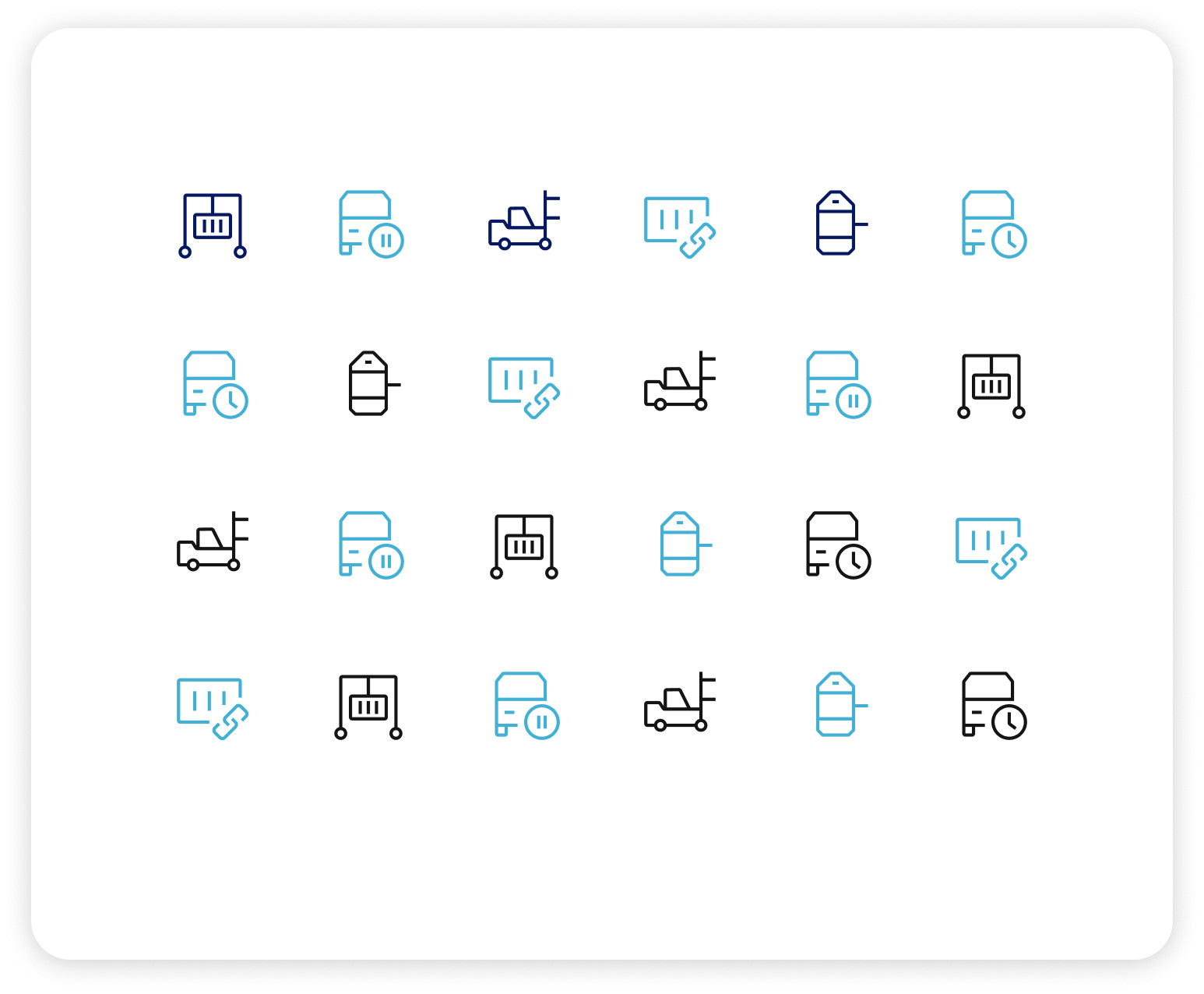
Icon Library Maersk DS
Background
In my role as a UX design intern at Maersk, I design and implement a icon library for the Maersk Design System.
This project was initiated to address specific needs identified by the APM Terminals team, who required a set of custom icons to enhance their digital products and interfaces.
This project was initiated to address specific needs identified by the APM Terminals team, who required a set of custom icons to enhance their digital products and interfaces.
Identifying User Needs
The process began with a thorough analysis of the existing design system and an assessment of the iconography requirements from the APM Terminals team. I facilitated multiple meetings with both the APM Terminals and MDS teams to gain a thorough understanding of their requirements, gather feedback, and ensure that the new icons would seamlessly align with their functional and aesthetic criteria.
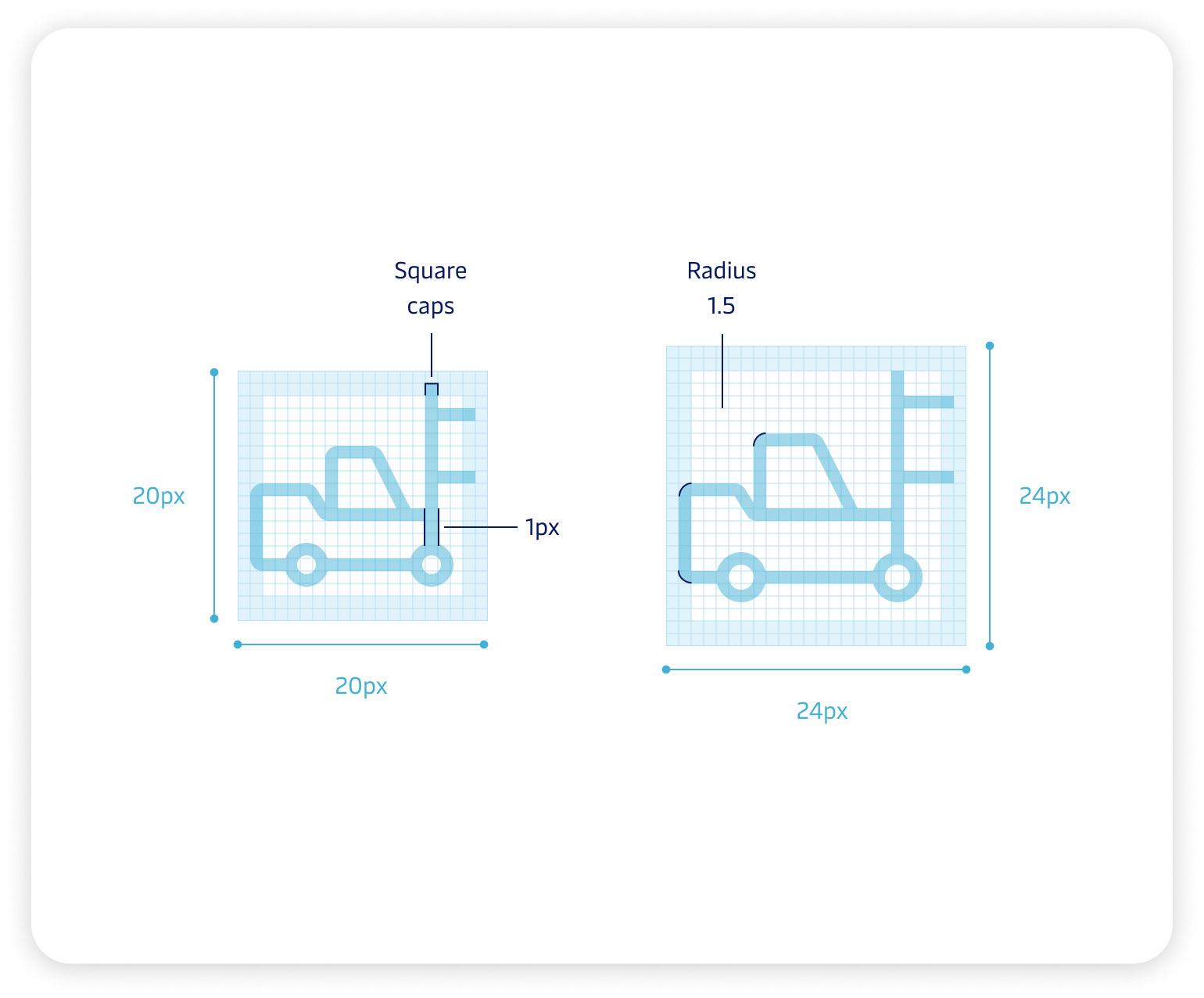
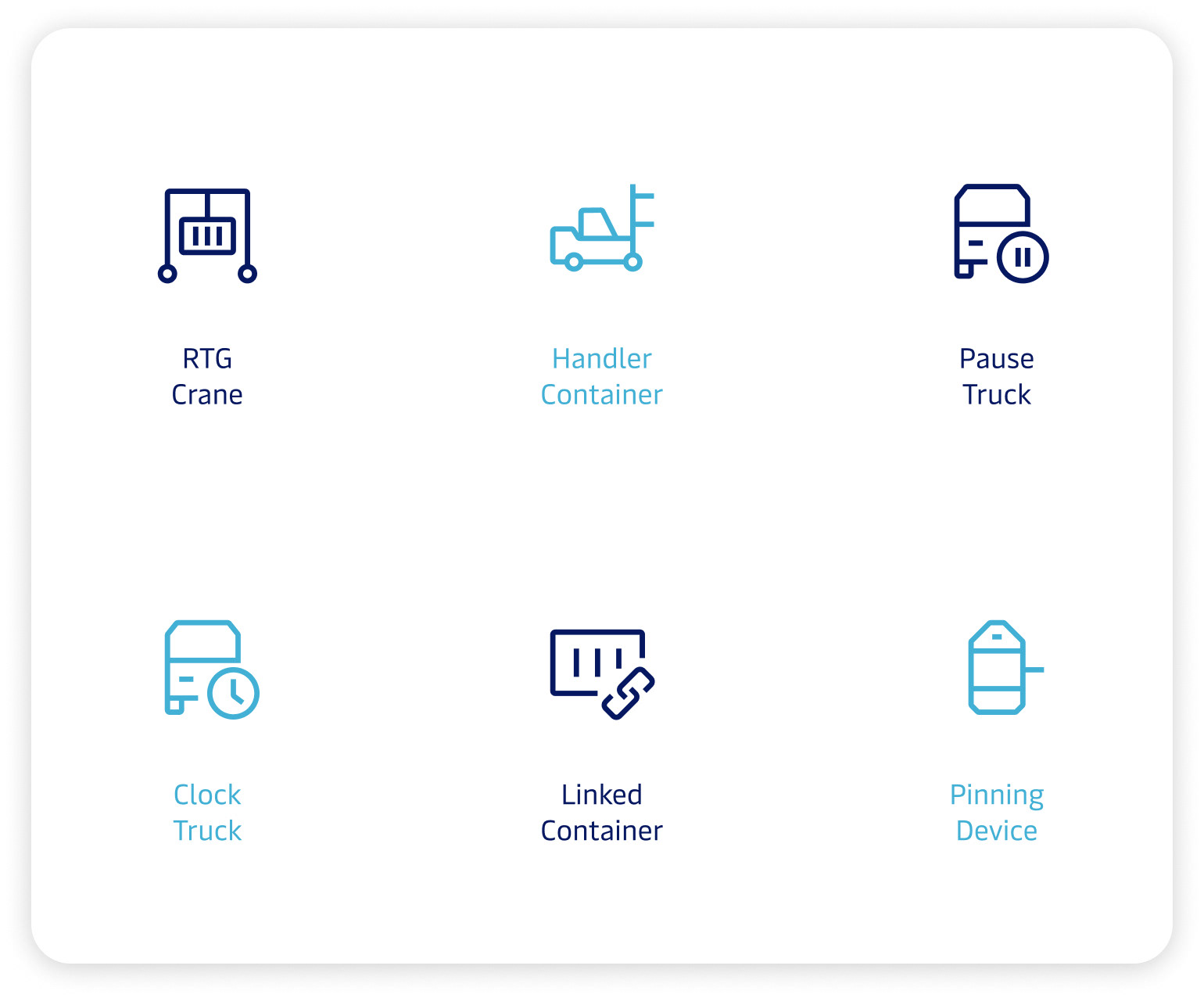
Designing Tailored Icons
I designed a series of icons that adhered to Maersk's visual identity while providing the necessary functionality. The design phase involved sketching initial concepts, iterating based on feedback, and refining the icons to ensure clarity, scalability, and consistency.
Publication and Implementation
The new icon library was successfully published and it has since been adopted by the APM Terminals team, significantly enhancing their user interfaces. The project not only fulfilled the immediate needs of the APM Terminals team but also contributed to the overall strength and flexibility of theMDS, supporting future design initiatives.
Conclusion
This experience showcased my ability to identify user needs, collaborate with cross-functional teams, and deliver design solutions that drive consistency and usability across large-scale digital products.
03
Responsive Mobile Design
Background
Designing Responsive Mobile Products for APM Terminals.
In this project, I focused on adapting desktop products from the APM Terminals team's design to mobile platforms, ensuring a seamless user experience across devices.
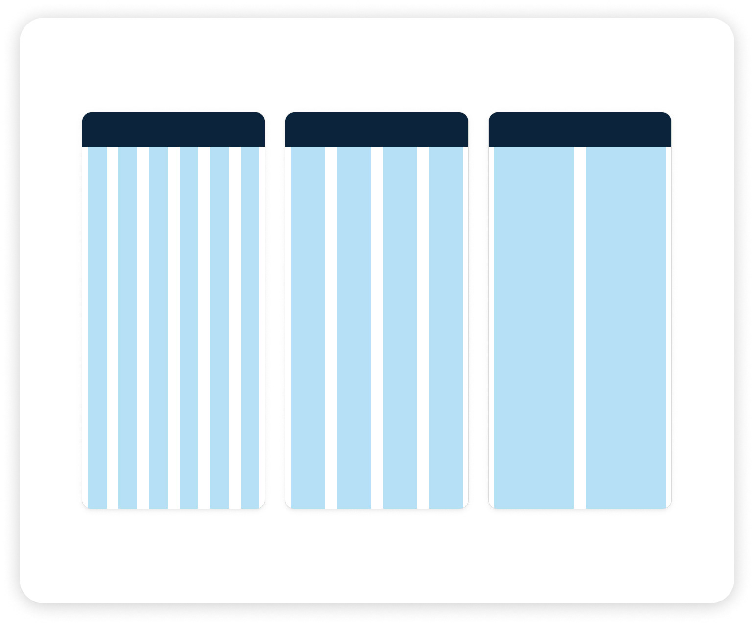
Utilizing Responsive Design Principles
I employed responsive design principles, including fluid layout, flexible grids, and scalable typography, to create mobile products that adjust gracefully to different screen sizes and orientations.
Product: Request Service
One key product I worked on was the Request Service portal, enabling customers to request value-added services for their cargo and make online payments when applicable. The payment module is configurable to meet each terminal's specific requirements
Prototypes
This project involved developing user interfaces that seamlessly adapted to various screen sizes, ensuring an optimal user experience on mobile devices.
This experience not only involved designing mobile products but also collaborating closely with the APM Terminals team to ensure alignment with their design vision and terminal-specific needs.
Learnings
Gained valuable experience in creating adaptable design solutions within corporate constraints and collaborating across multidisciplinary teams.