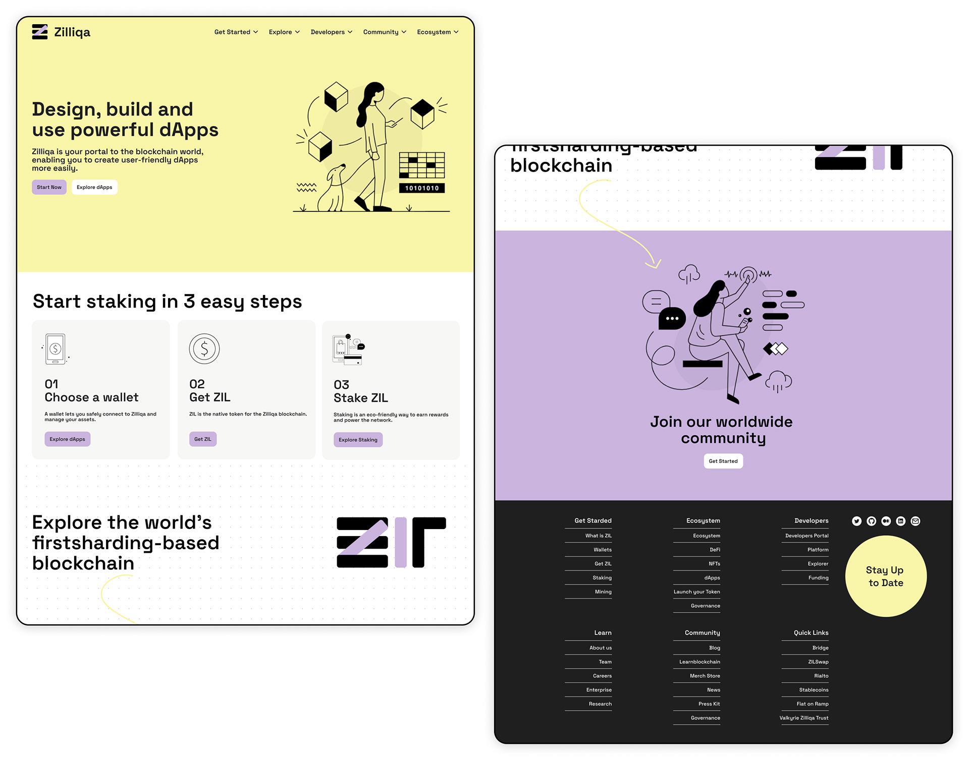
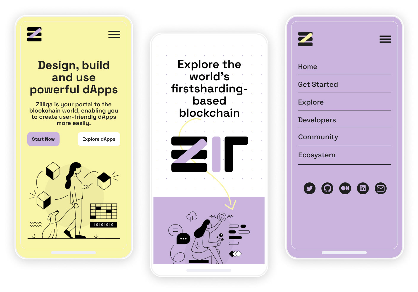
01
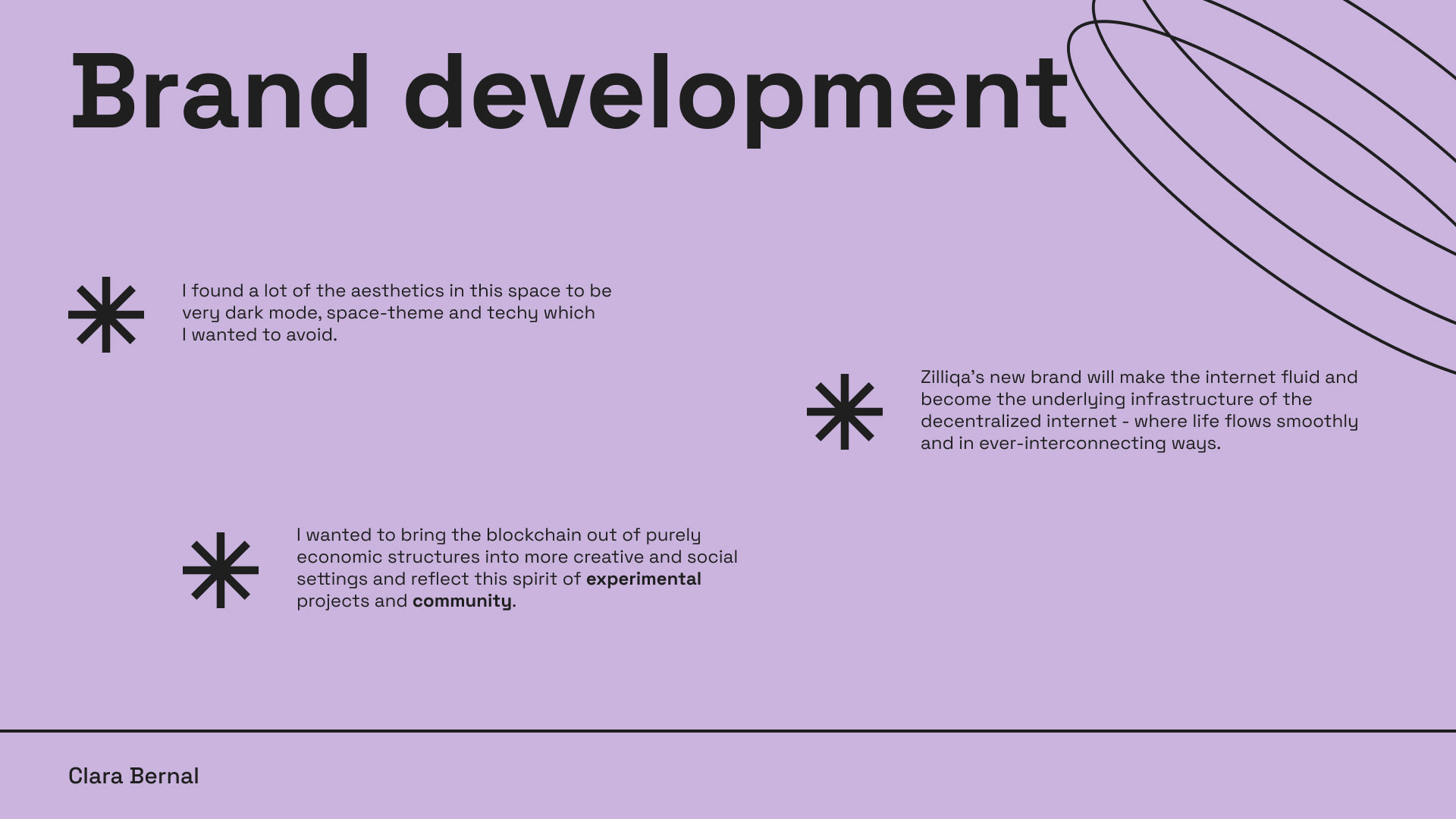
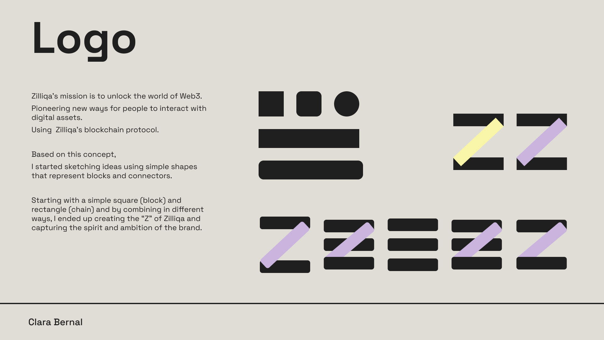
Zilliqa
Challenge for Digital Designer
Date: February 2023
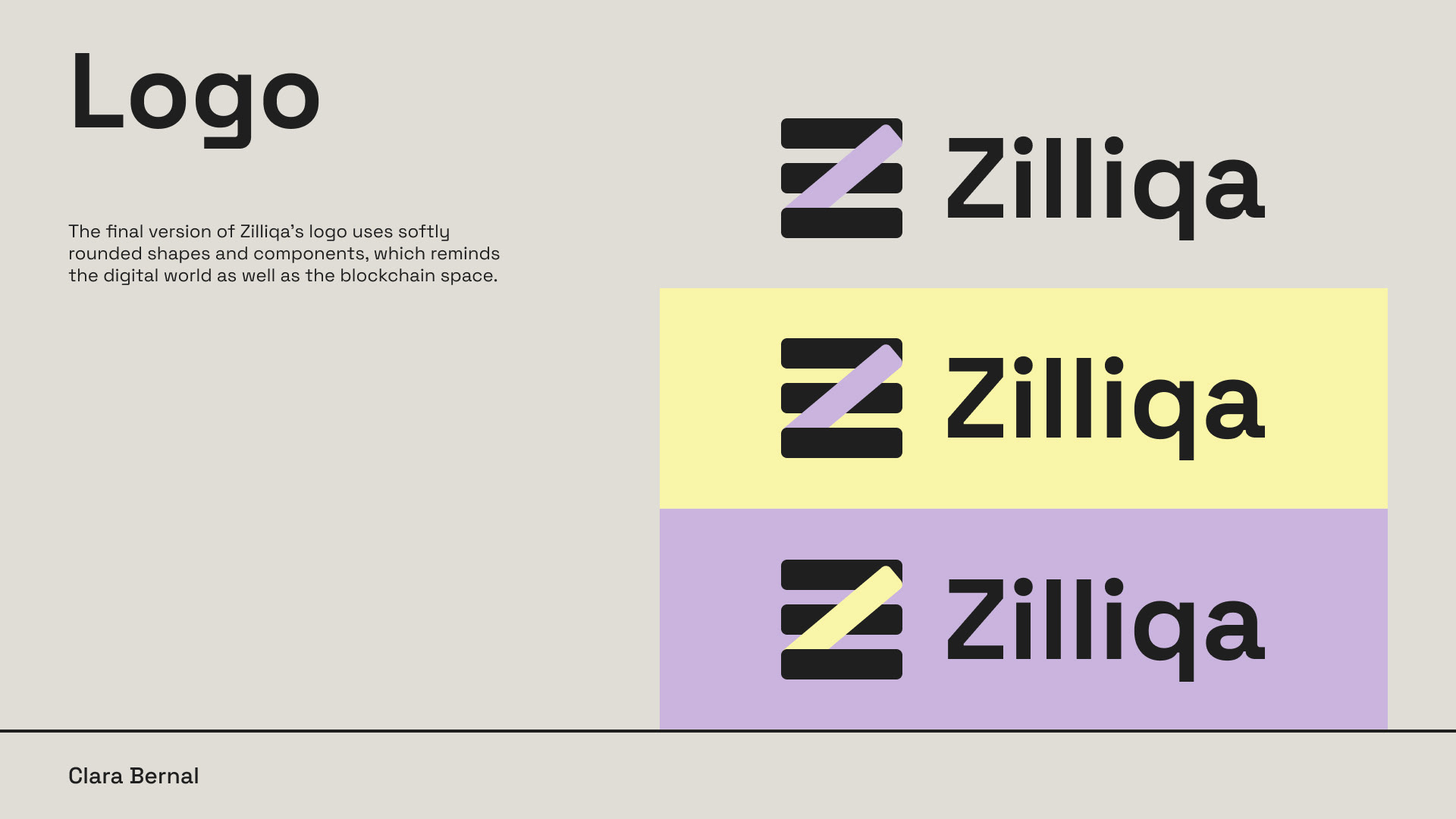
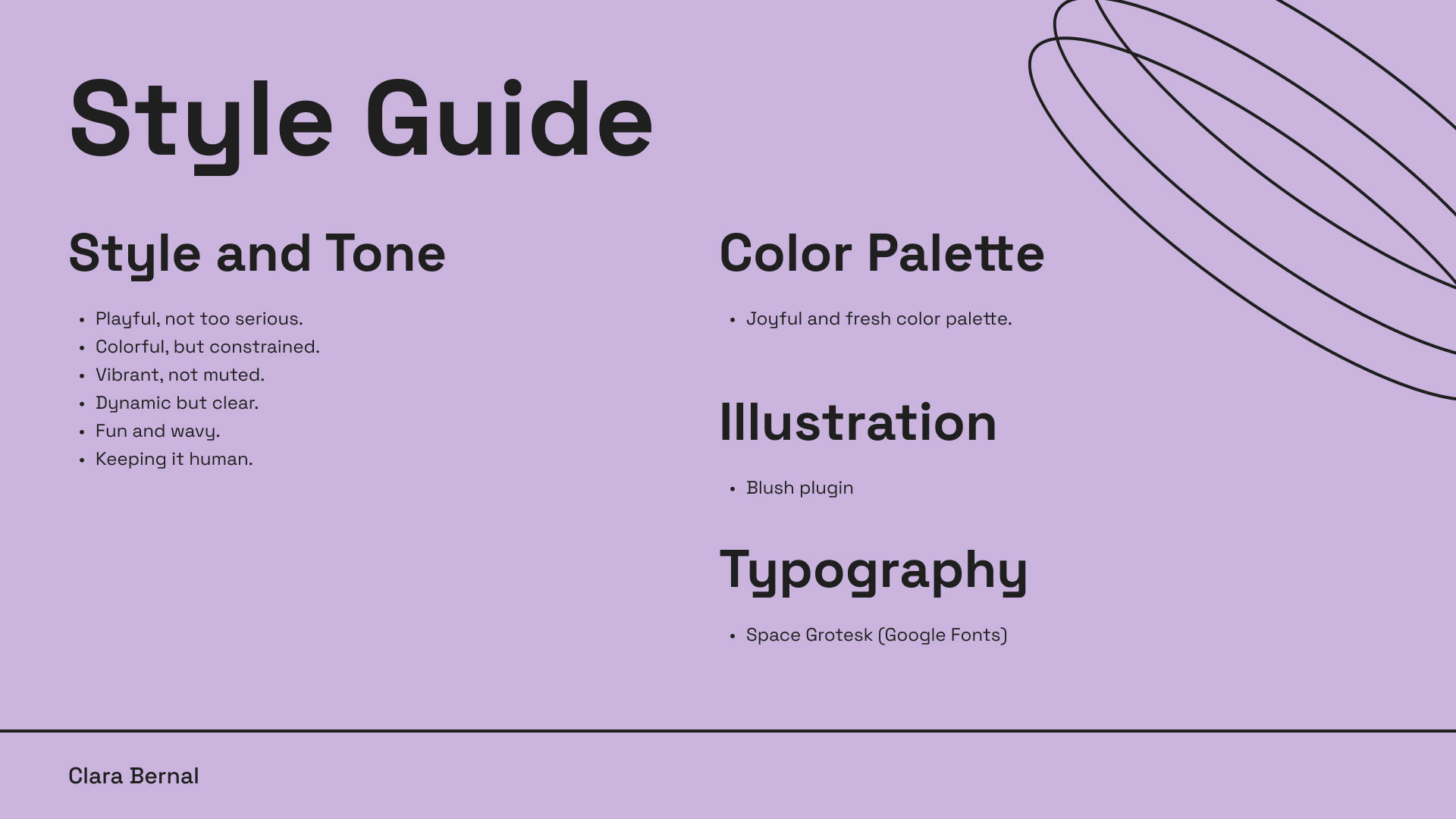
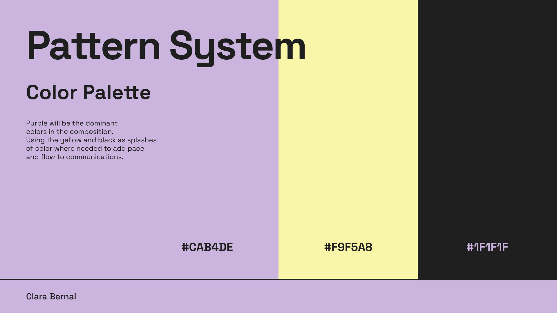
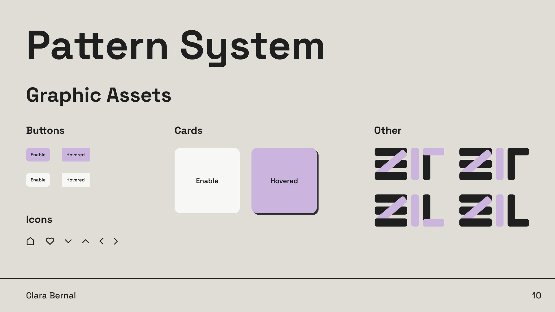
Goals: Create a new visual identity for Zilliqa including: Logo, Pattern system and UI design for Zilliqa’s homepage.
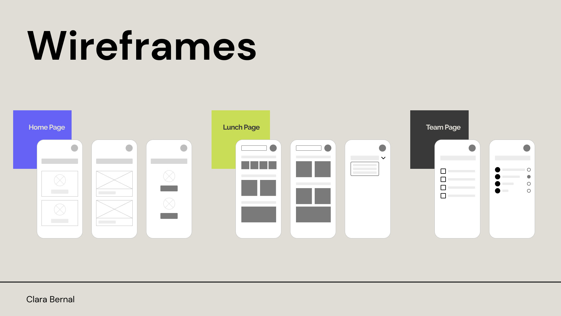
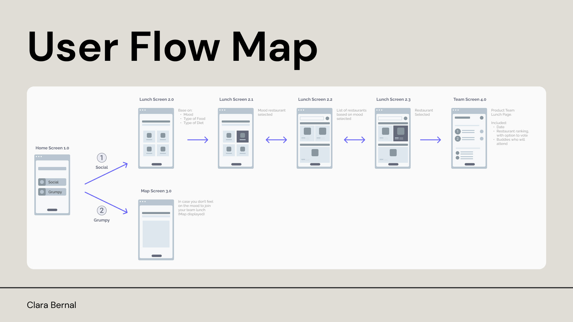
02
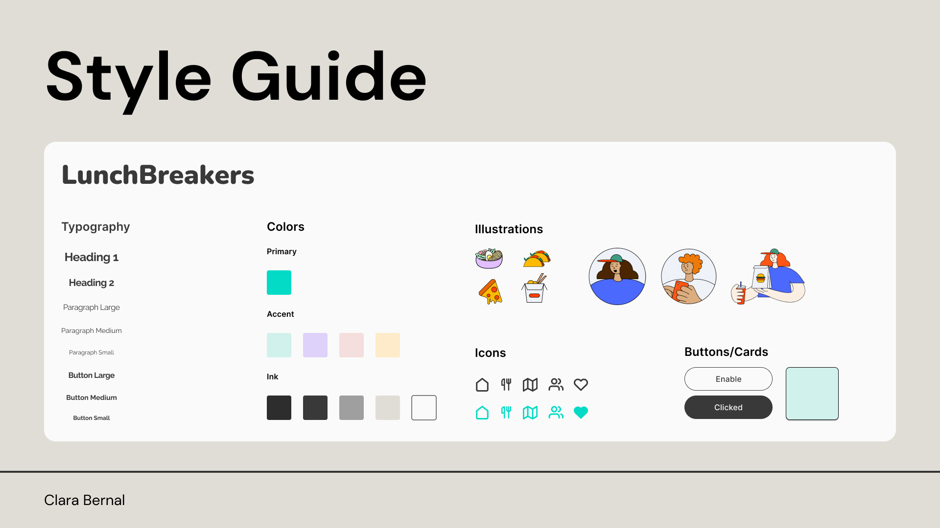
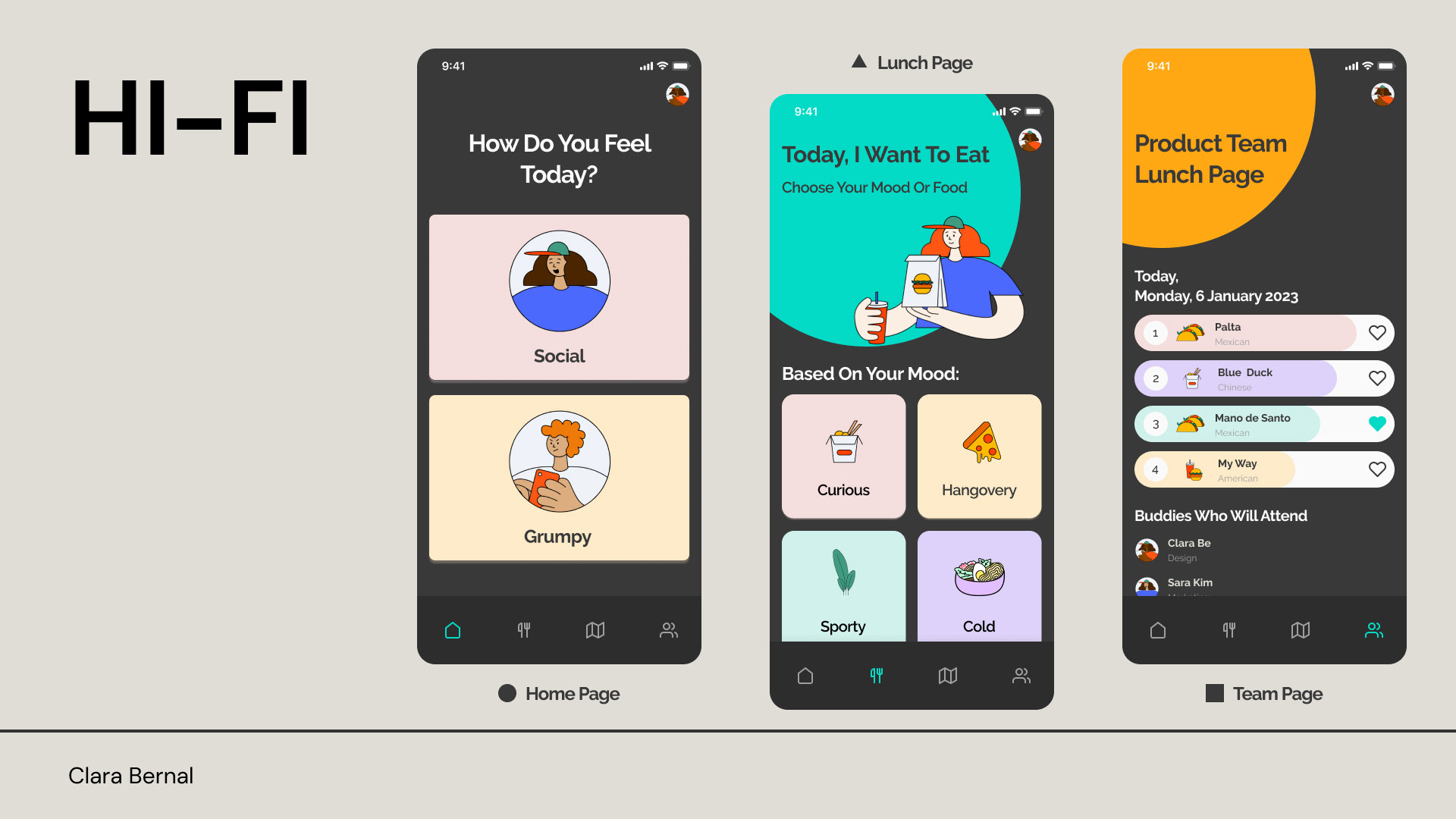
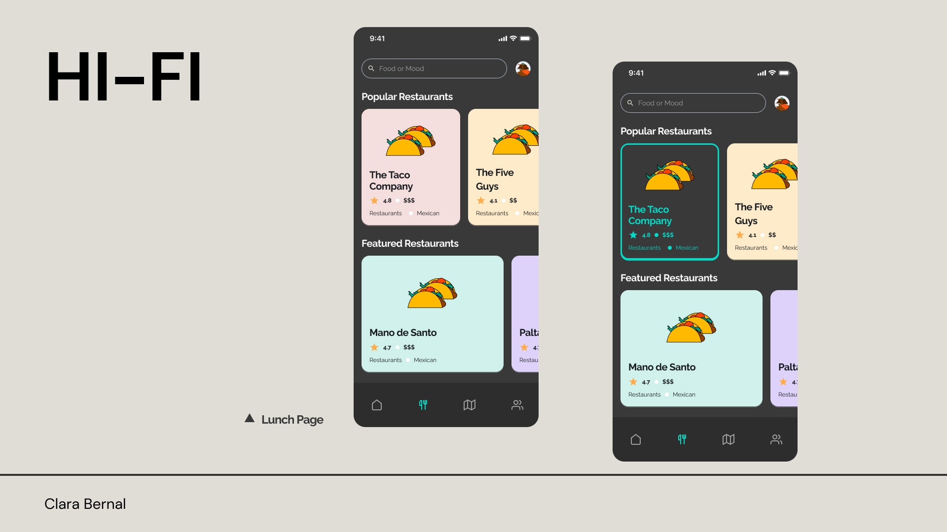
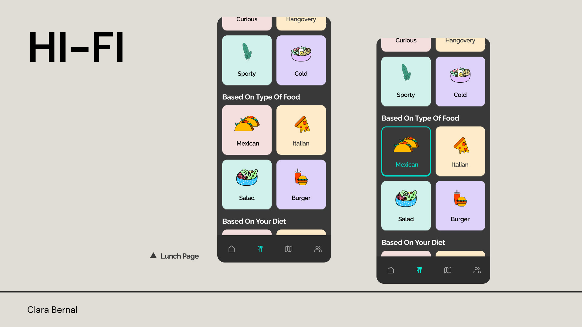
Crealogix
Challenge for Digital Product Designer
Date: February 2023
Context: Design an app that allows colleagues to decide and agree on where to go for lunch.
Goals:
> Be more social over the lunch break.
> Help newcomers find good places for food around the office.
03
CPH Game Lab
Challenge for UI Designer
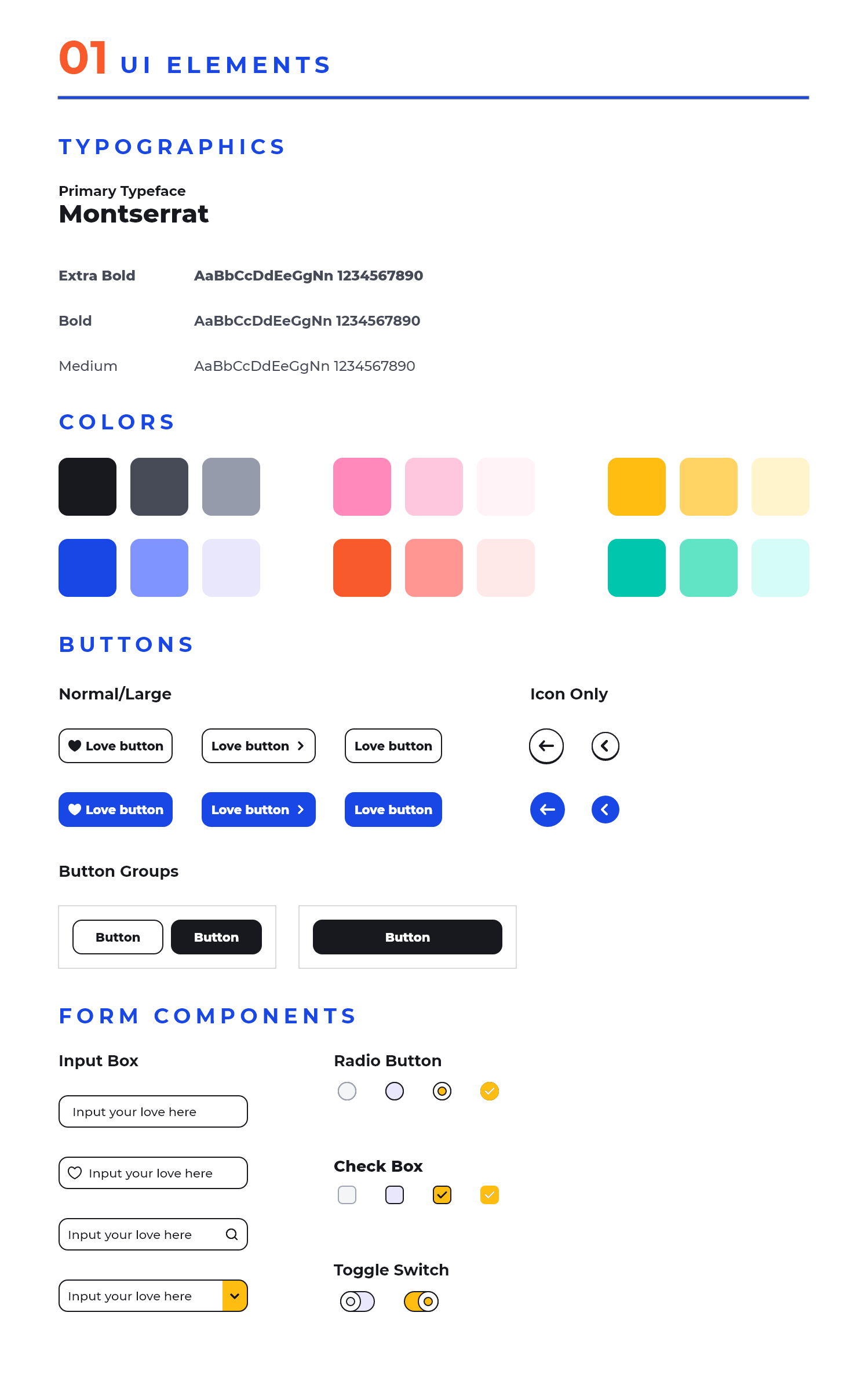
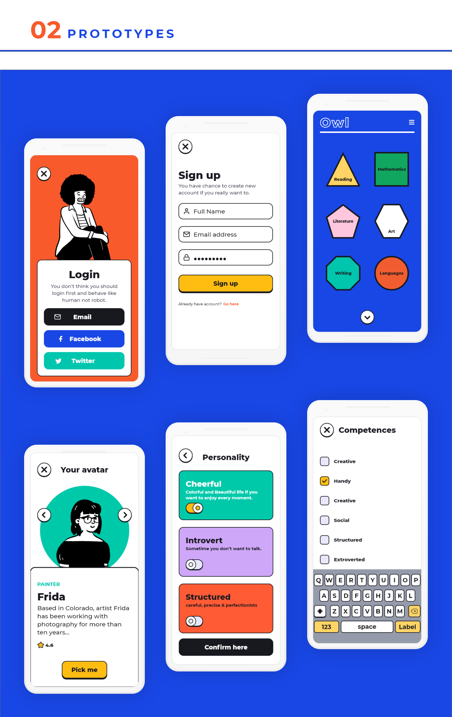
Date: August 2020
Design 4-6 screens for at mobile game for students (male/female 18-30 years old), that can motivate them to stay in school.
The look and feel should be simple, easy to use, but with a playful/gamelike vibe.
The look and feel should be simple, easy to use, but with a playful/gamelike vibe.
Focus on:
1. Overall style (color scheme, font, buttons)
2. How could the Avatar builder look
3. How does a list look
4. How does a list entry look when active
2. How could the Avatar builder look
3. How does a list look
4. How does a list entry look when active
04
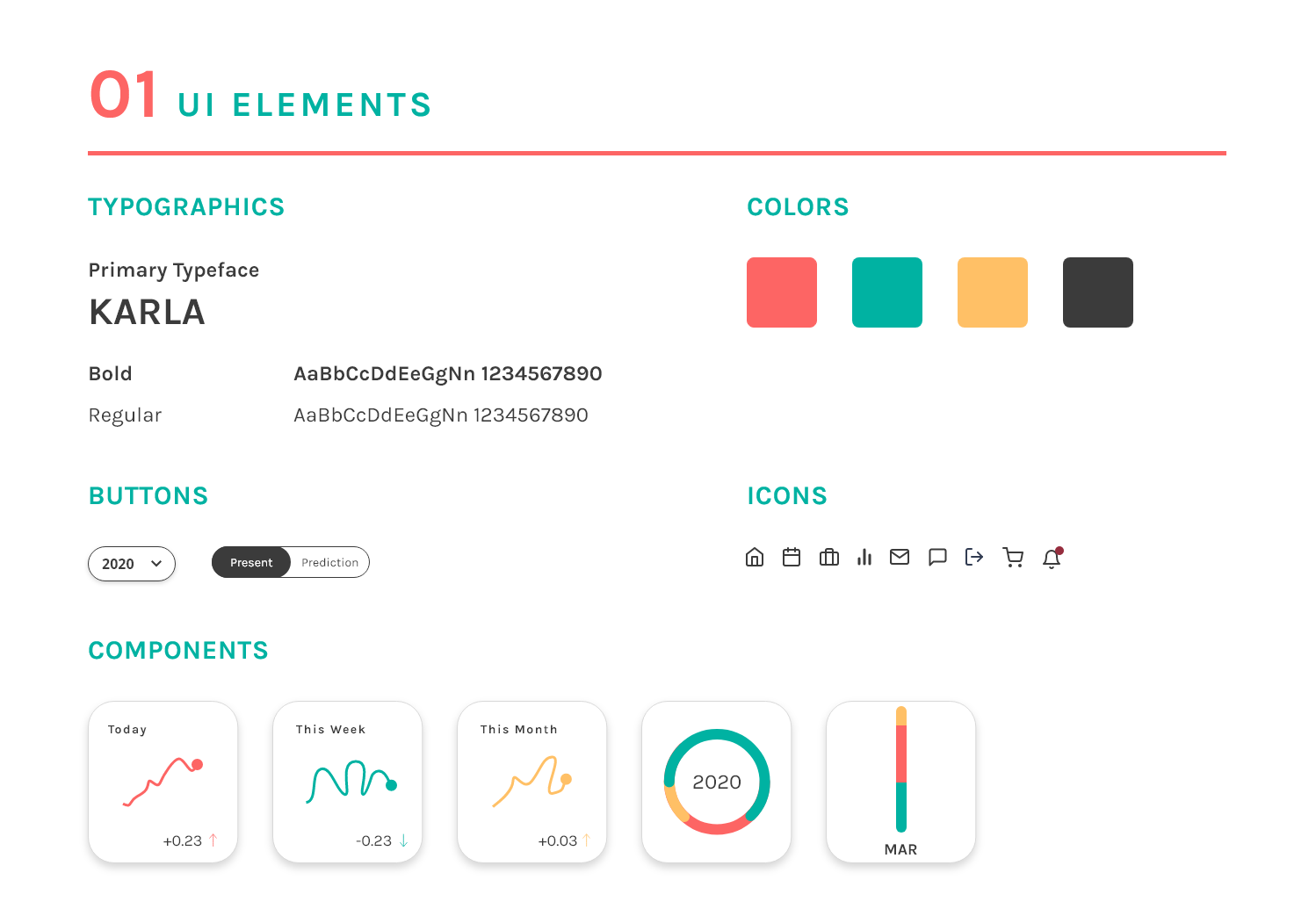
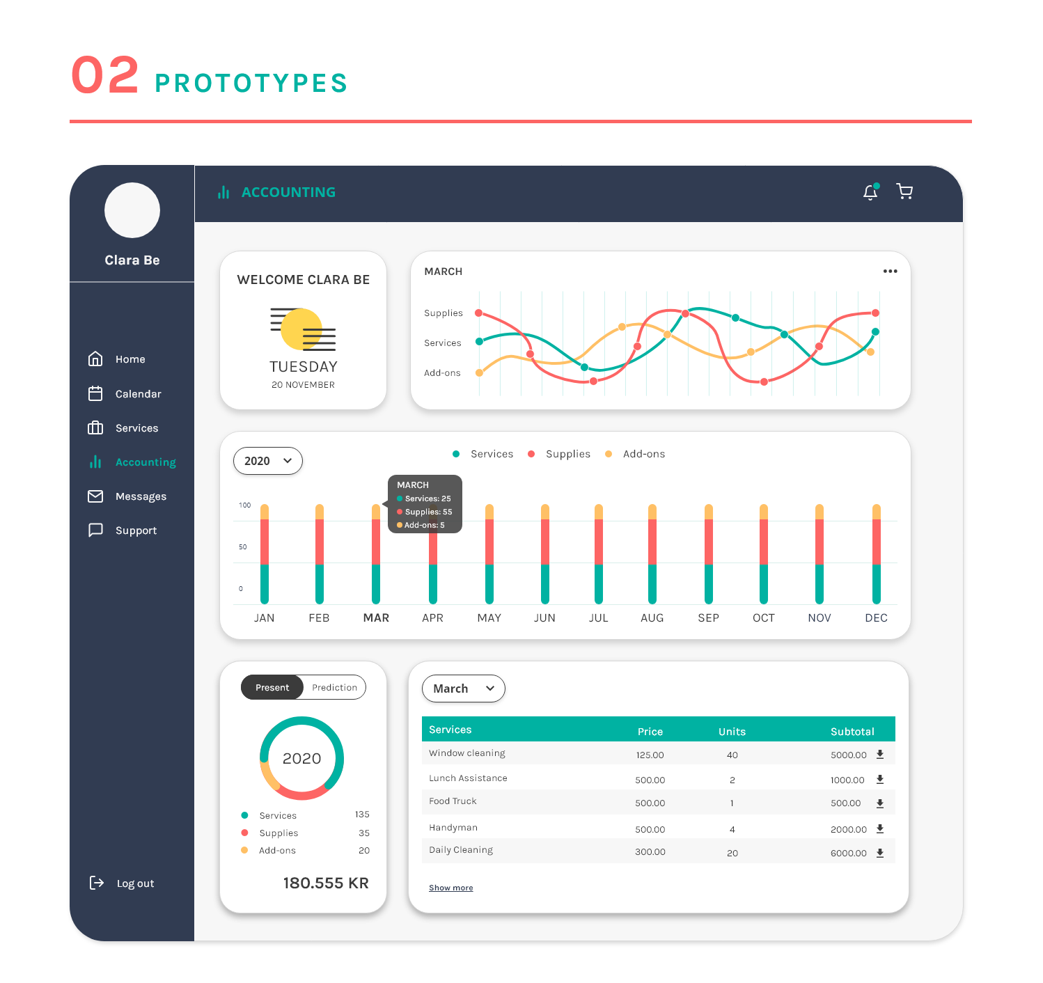
Good Monday
Financial Dashboard Design - Challenge for Digital Product Designer
Date: August 2020
GoodMonday is a digital platform – a marketplace for workplace experiences.
We connect companies with local suppliers offering various goods and services including cleaning, lunch, office supplies, plants etc.
We connect companies with local suppliers offering various goods and services including cleaning, lunch, office supplies, plants etc.
Problem to solve:
Create an overview for the companies and help them to visualize
- How much they actually spent running the office last week.
- How much they will be spending next month.
- How much they spend per employee.
- How their spending is distributed across services.
- How their planned growth will impact their budgets.
- How they spend compared to the market, the industry or companies alike.
- How their investing in people pays off in terms of engagement, loyalty, or productivity.
05
Proptech Denmark
UI design assignment
Date: January 2020
Goals:
1.Create visual and engaging reading experience.
2.Make a complex real state text, easy to understand for the users.
3.Structure and layout a clean and simple one-page scroll.
4.Design clear infographics which match the complex data.
1.Create visual and engaging reading experience.
2.Make a complex real state text, easy to understand for the users.
3.Structure and layout a clean and simple one-page scroll.
4.Design clear infographics which match the complex data.
UI CHALLENGE
01PHASE: IDEATION
Researched real state web: colors, fonts, structure, content, text label, to get an overview how this industry works.
Processed the data collected.
Defined who are the users, their needs and goals to determine the paint points.
Researched real state web: colors, fonts, structure, content, text label, to get an overview how this industry works.
Processed the data collected.
Defined who are the users, their needs and goals to determine the paint points.
02PHASE: ENVISION
Wireframed the ideas using basic colors palette, geometric shapes and lines and plan the content hierarchy.
Prototyped the findings in a high-fidelity front-page.
Wireframed the ideas using basic colors palette, geometric shapes and lines and plan the content hierarchy.
Prototyped the findings in a high-fidelity front-page.
VISUAL DESIGN CHALLENGE
All good stories have a beginning, middle and end. At the beginning of the infographic, I introduced the problem or thesis. From there, backed it up with data. Finally, ended the infographic with a conclusion.
Process the data, Check my sources, Create a wireframe, Have a story, Set the tone and Test along the way.
Process the data, Check my sources, Create a wireframe, Have a story, Set the tone and Test along the way.
Results:
Created an infographic which matches the subject matter, turning the information into a visually stimulating, cohesive design that tells a story.
Created an infographic which matches the subject matter, turning the information into a visually stimulating, cohesive design that tells a story.
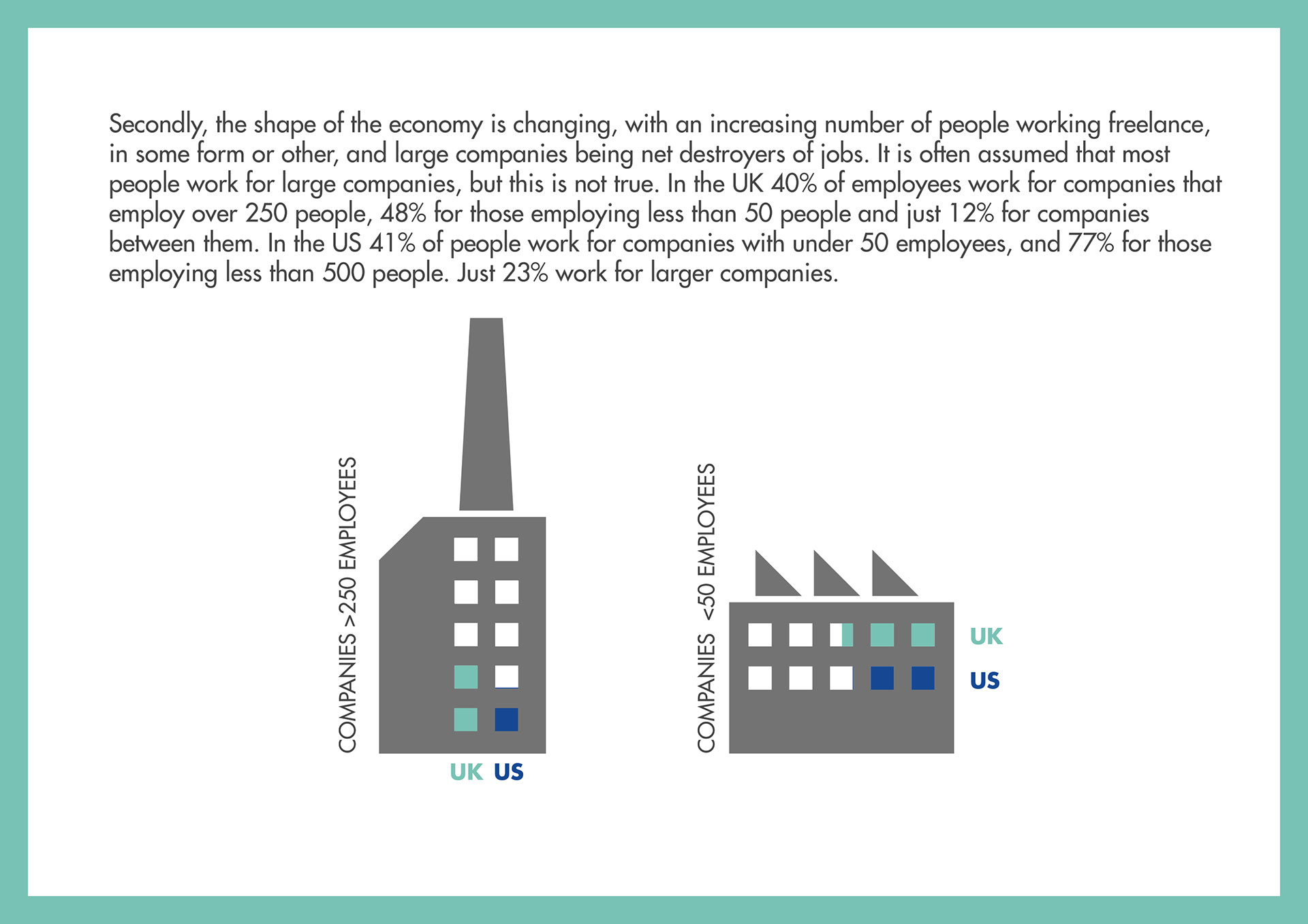
Infographic
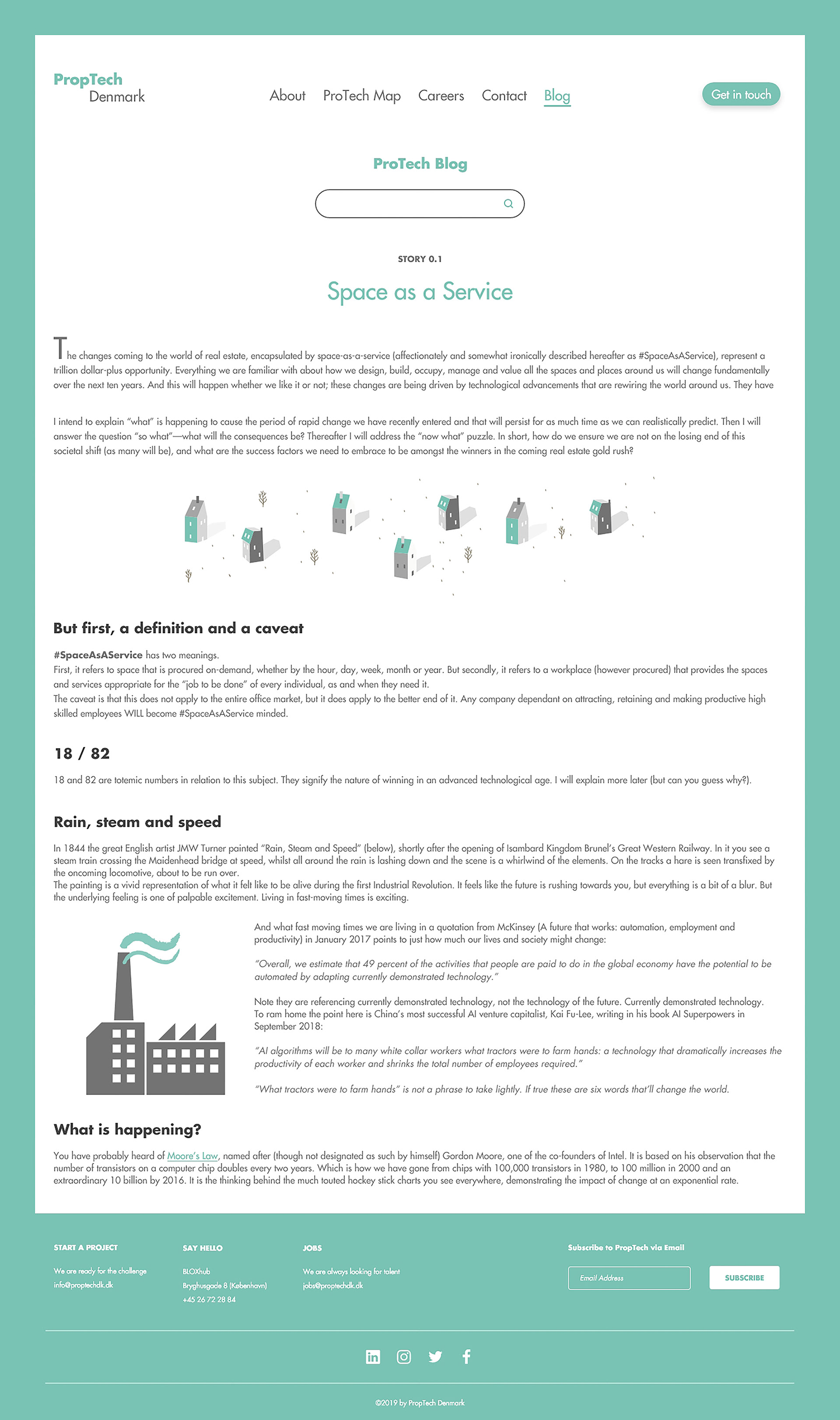
Website Layout
06
Pensure
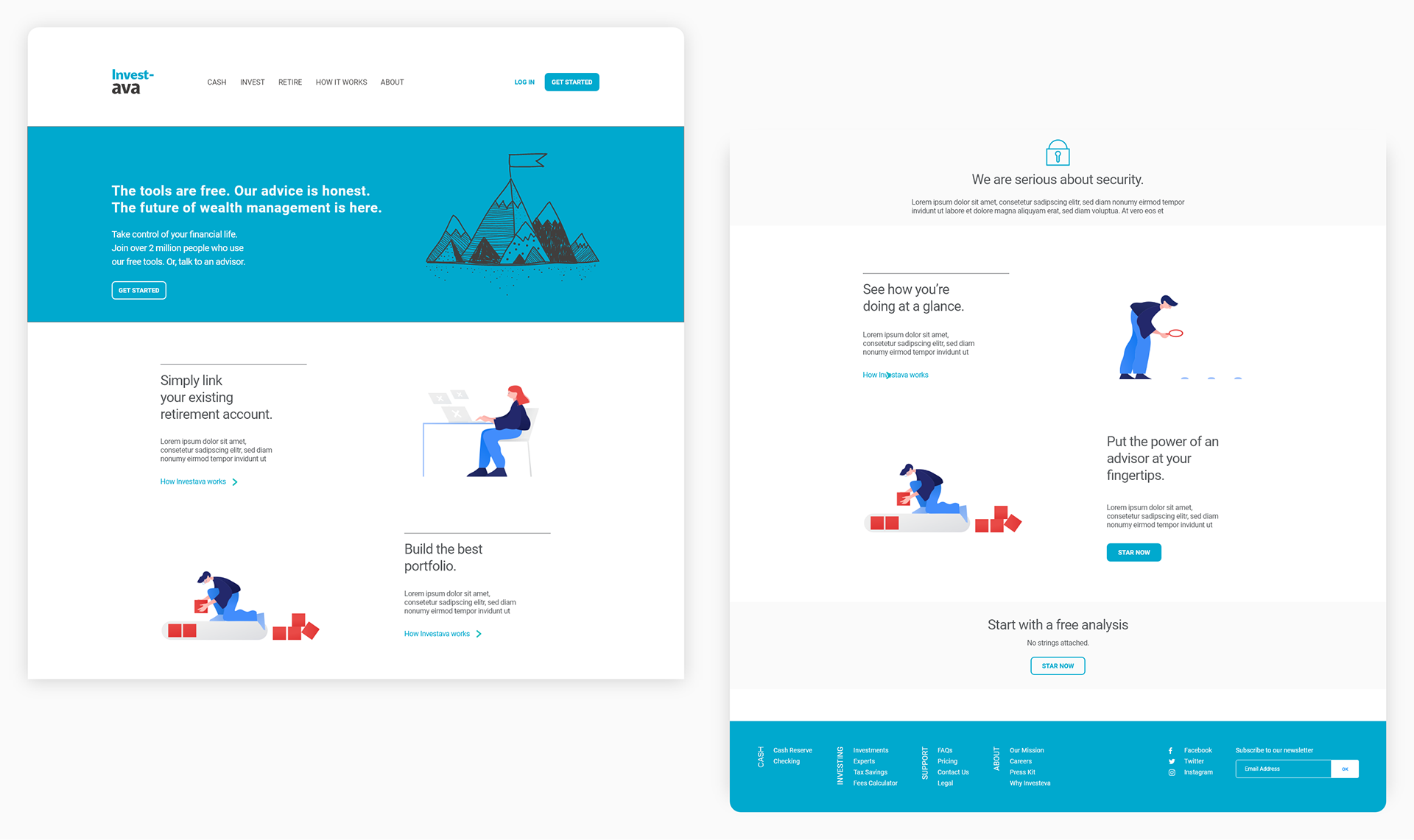
UI/UX CASE - Proposal of how a front page of a robo-advisor’s website could look.
Date: December 2019
During the last 5 years, robo-advisors have grown in popularity among people who want to invest their personal savings. A robo-advisor is a digital platform, where private investors are able to invest their free savings in stocks and other securities
at a low cast.
at a low cast.
Goals:
1.Translate a complex financial content into a clear design
2.Structure and layout a clean and simple homepage
1.Translate a complex financial content into a clear design
2.Structure and layout a clean and simple homepage
07
Crediwire
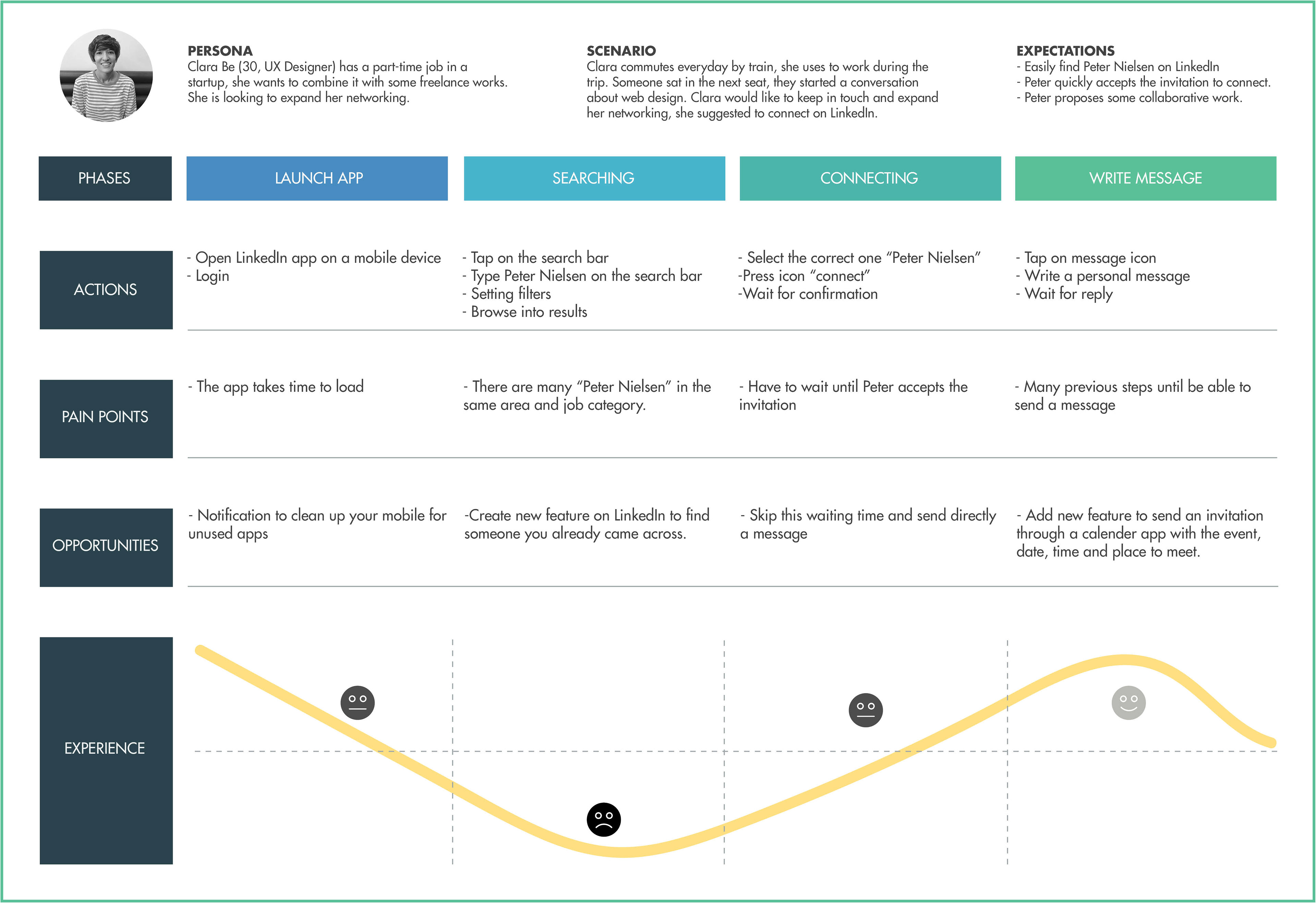
UX Designer case - Design a customer journey map
Date: January 2020
CrediWire is free platform offering to companies automatic reporting to the bank, auditor or board. Design a customer journey map that provides a good User Experience when you try to find someone on LinkedIn.
Goals:
1. Define the succession of touchpoints between the user and a product.
2. Understand the real needs and actual experience of the user
1. Define the succession of touchpoints between the user and a product.
2. Understand the real needs and actual experience of the user
01Phase: Process & structure data
Defined my Persona, scenario, expectations of my user, journey phases, actions, pain points and the opportunities (or solutions).
Defined my Persona, scenario, expectations of my user, journey phases, actions, pain points and the opportunities (or solutions).
02Phase: Envision
Sketched the ideas and designed a final journey map.
Sketched the ideas and designed a final journey map.
Results:
A journey map that solves the pain points of a LinkedIn user, adding new features to the look and feel of the interface and improving the web experience.
A journey map that solves the pain points of a LinkedIn user, adding new features to the look and feel of the interface and improving the web experience.
08
Redesign concepts
Date: August 2019 -
Food delivery app
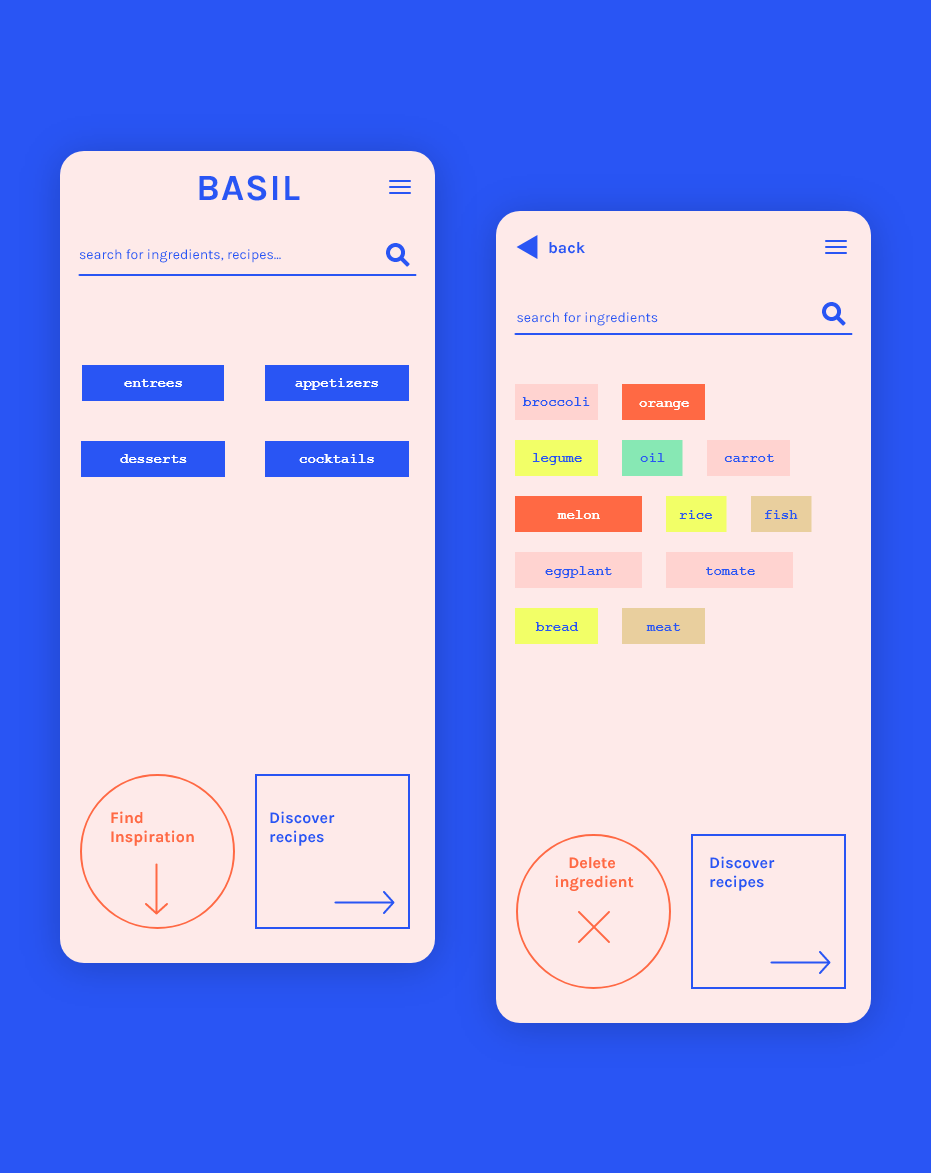
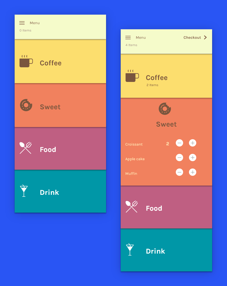
Recipe app
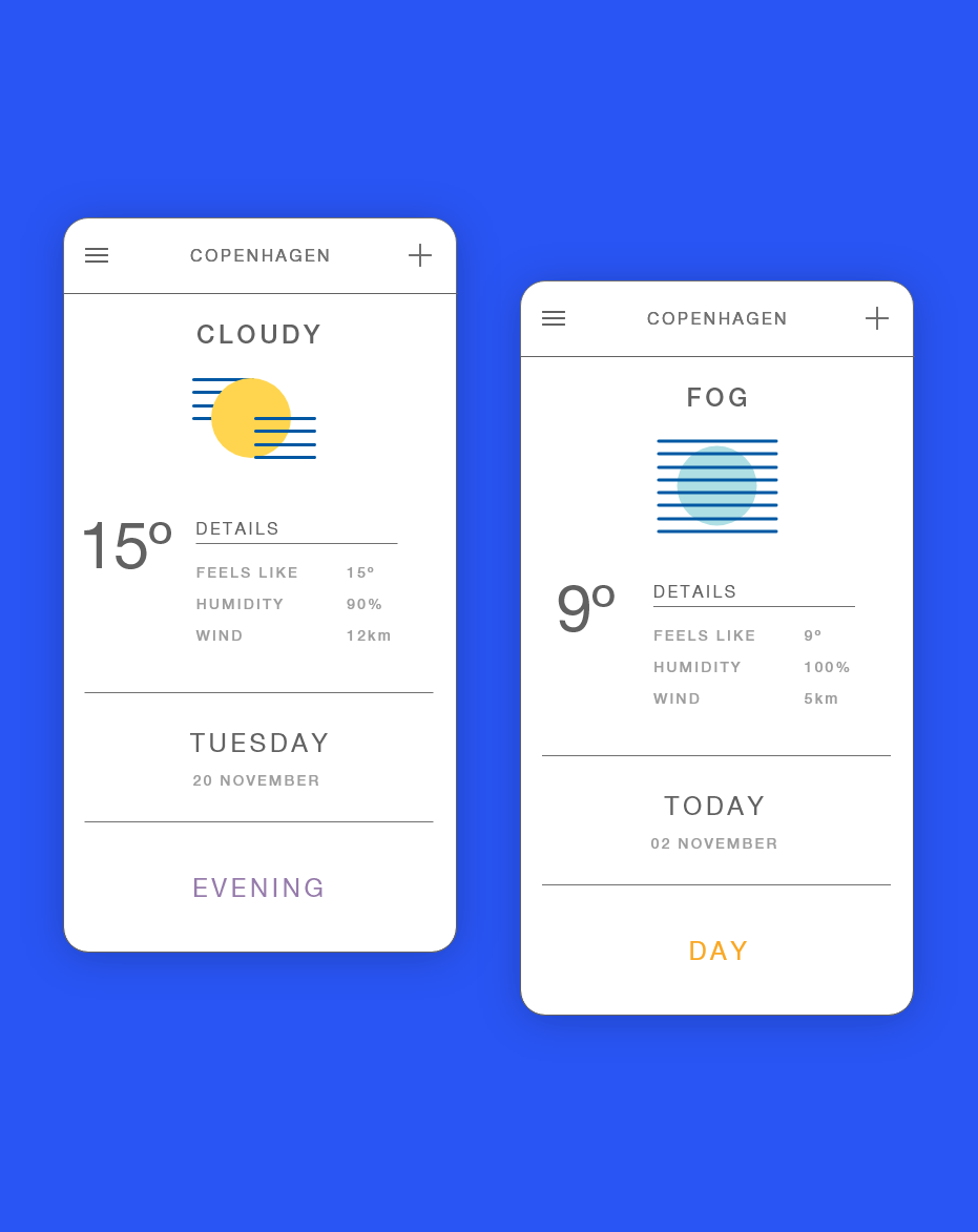
Weather app
Thanks for reading! ✌